Happy 90th Birthday Shirley Hughes!

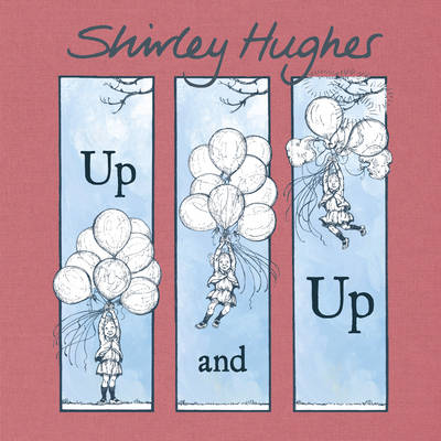
Today is Shirley Hughes’ 90th birthday, and I wanted to use this wonderful occasion to look at one of my favourite books of hers, Up and Up!, which was first published in 1979, and was re-released this year by Red Fox.
We are accustomed to Hughes’ splendid timeless paintings and wonderful double-spreads depicting every day life:
Yet, Shirley Hughes has always been a fan of comics and graphic novels and is herself am accomplished graphic novelist, usually choosing ink illustrations as her preferred way of drawing in this format:
The boundaries have always been blurred between picturebook and graphic novel, with some picturebooks ‘borrowing’ from graphic novel conventions. Up and Up! is more specifically a graphic wordless picturebook; this is a format that fascinates me, because it is created thanks to the fusion of two forms that I particularly enjoy: the graphic novel of course, and wordless picturebooks.
In wordless narratives, this borrowing of graphic novel conventions is focused on the use of visual sequencing; “sequential art” was a term coined by Will Eisner to describe comics (I thoroughly recommend you look at his Comics and Sequential Art if you have an interest in how comics work).
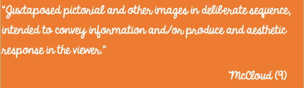
Scott McCloud took the term sequential art further to create his own, widely accepted, definition of comics (and again, McCloud’s book is a must if you are interested in the comic book form):
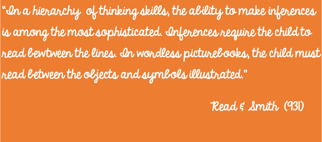
Meanwhile, some academics have argued that wordless narratives might in fact be too sophisticated for young readers to understand because children do not yet have the right visual literacy skills to understand images:
This might true of some wordless picturebooks but I would argue that using comic conventions such as panels and gutters, which together create “sequential art”, allow for a greater understanding of a story within a wordless narrative. In picturebooks, huge temporal jumps can happen within the narrative, not only during page turns, but also within each double spread, particularly if it is split recto/verso. Much of the action is frozen in time and the rest of the story only implied. A lack of text supporting the narrative might make it difficult for young readers to grasp the story. Using graphic elements within a wordless picturebook allows for the action to be broken down, to be less static, therefore supporting the reader in understanding the story unraveling in front of their eyes, in an almost cinematic style. Looking at Up and Up! for example, it is little surprise therefore to learn that Shirley Hughes is a big fan of Buster Keaton (The Guardian). The comedic, almost absurd type of tale mixed with its format is certainly very reminiscent of the master of the silent sketch.
According to Eisner, the reader’s interpretation of the narrative in a comic is predetermined by the artist; it is the artist who decides from which viewpoint the reader will see the narrative (90). It is also the artist who decides on the pace of the narrative, through his/her choice of panel occurrence and size. The reader, unknowingly, is influenced and guided in its interpretation of the story by the comic grammar used to support the narrative.
Up and Up!, the story of a little girl who will go to great lengths to be able to fly and who when her dream comes true creates astonishment and good dose of chaos wherever she goes, is a superb example of how comic conventions not only support but enhance a wordless narrative.
One example of this is Hughes’ use of sequences of small panels which help focus the eye of reader, dissecting the action almost step by step. This is particularly successful when trying to work out what the little girl might be thinking, which is more difficult to express without words.
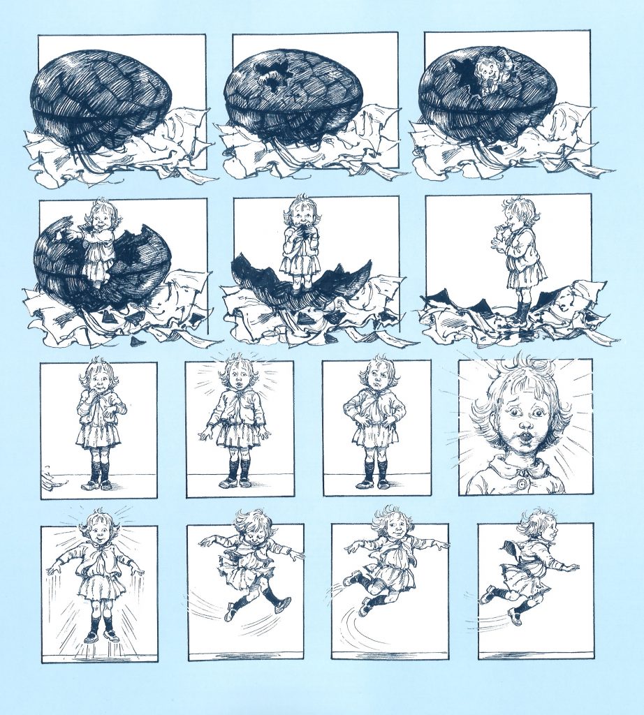
Separating each occurrence of the girl within a panel will allow readers to realise this is several pictures of the same girl (much like a photo album), and this separation is also supported in Up and Up! with the use of the blue background which helps the black and white panels stand out. Notice also how the little girl and the egg are spilling out of the panel frames, giving an impression that the frame itself cannot ‘contain’ them, hinting at that yearning for freedom and flying. Numerous small frames can also suggest a certain speed in the scene.
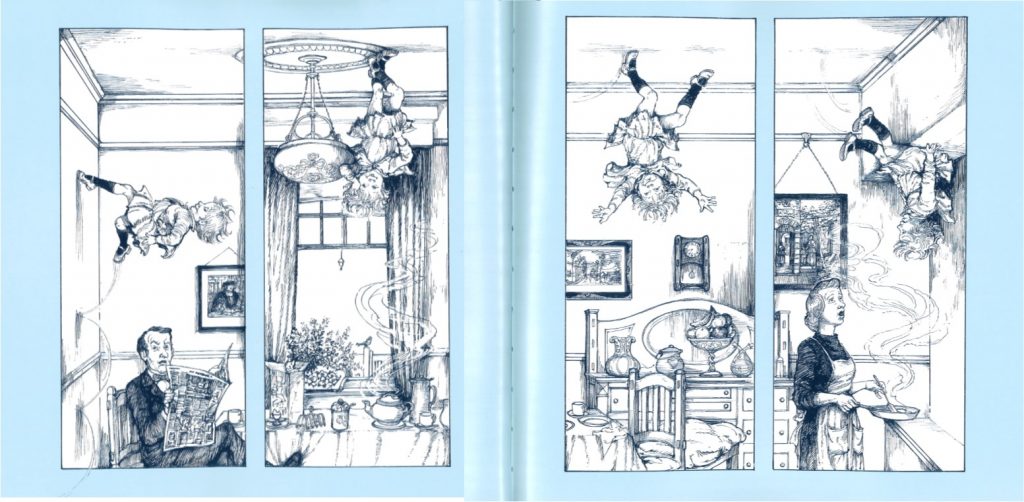
Another great example can be found in the double-spread below, where we get the full effect of the girl walking up the wall – broken down in four panels, this not only conveys her movement around the room, but the separate panels also allow the reader to focus on the reaction of her parents, and ‘read’ their reaction more easily. While young children might not be able to easily understand temporal movements, to ease the transition, Hughes uses a clever trick to help them understand that the little girl is moving but the rest are not: the second panel shows the end of the father’s foot while the third shows the end of the table and the fourth the end of the chest of drawers, linking each drawing with the other to create a full scene. This helps children realise, again, that it is not just several little girls, but one little girl moving in time and space.
Hughes also uses a variety of size of panels in order to tell her story, varying them in order to change the pace and focus of the action, as well as the viewpoint given to the reader. One of the examples of Up and Up! is how different panels express scale and height, which is vital in a story about flying! This spread is particularly wonderful, managing to convey both spacial and temporal movements.
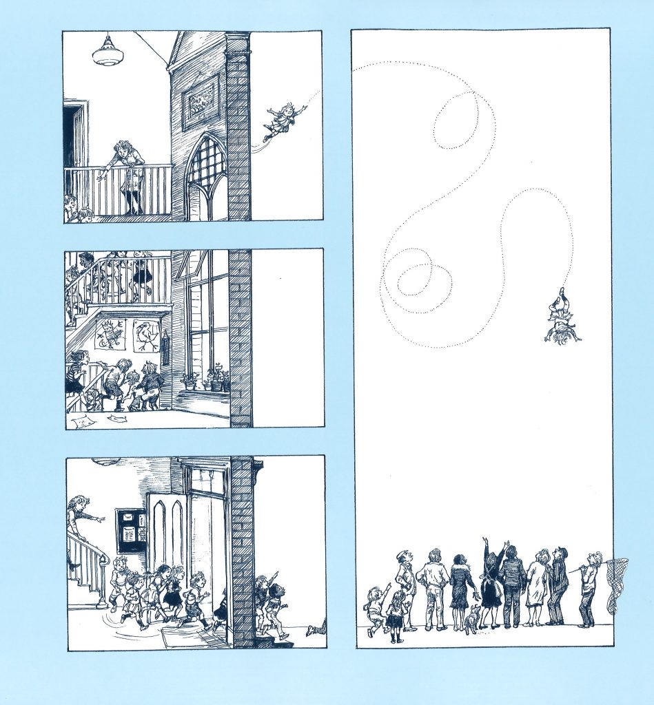
The wall also creates an extra gutter within the frame, between inside and outside. This features also used in this following more complex spread, using a cut-out view of a house, with its masonry creating spatial boundaries adding to those created by the gutter:
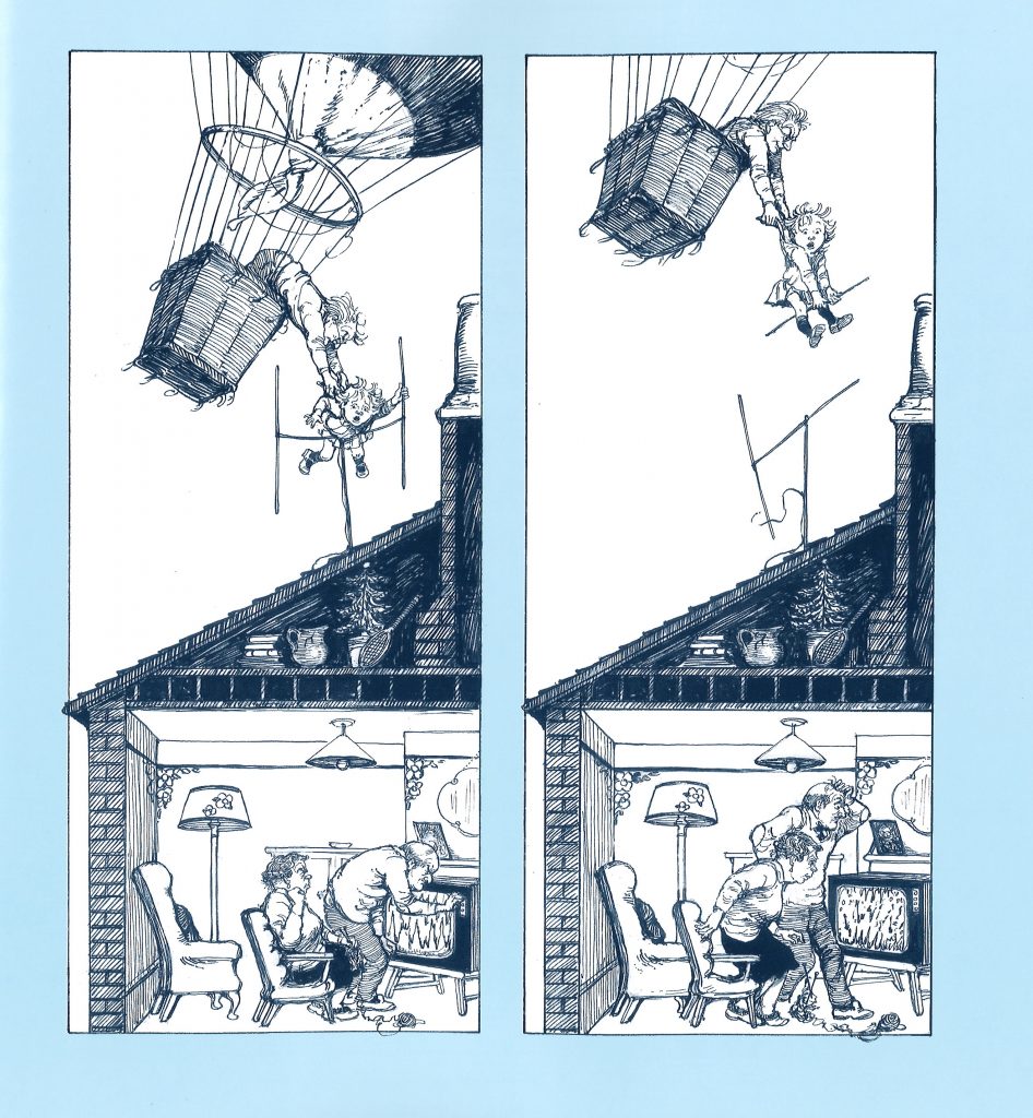
Another feature I wanted to highlight which supports the understanding of a the wordless narrative in Up and Up! is the use of rounded panel frames, as in this spread:
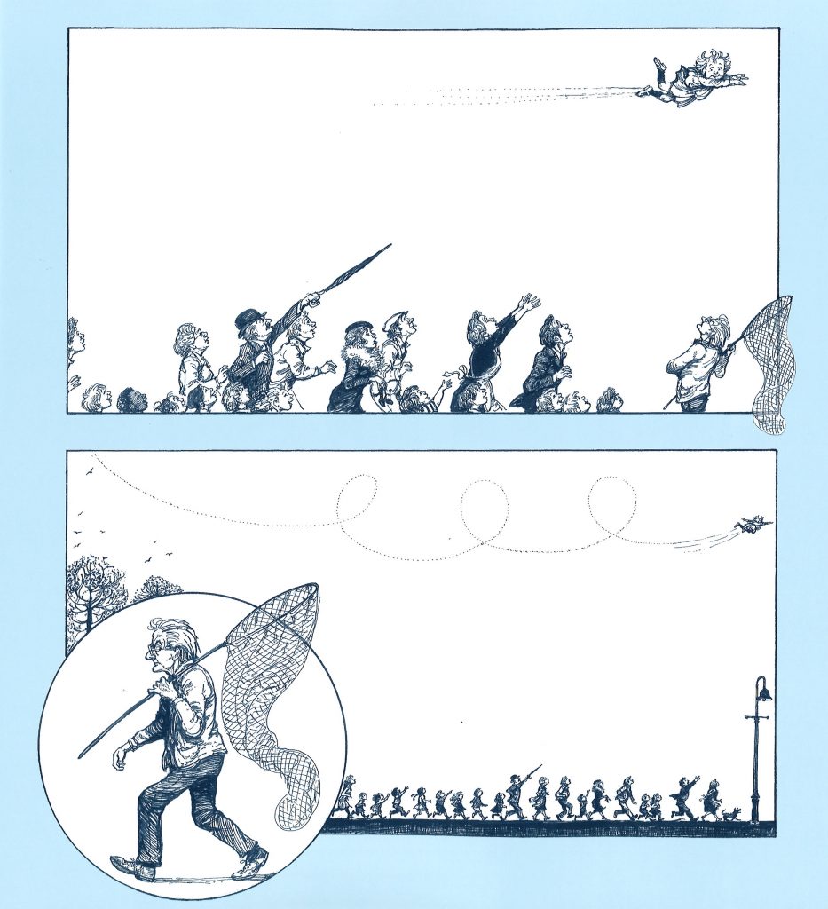
While the juxtaposition of frames might look complex (particularly with the net spilling from one into another), the use this rounded frame is to focus the reader’s attention on the old man’s actions, as if looking through a long lens (helped with proportions within the illustration), almost telling the reader ‘look, something is about to happen, what do you think it might be? What is this man doing?’
Never fear however, Shirley Hughes’ trademark birdeye views are also part of the narrative, which of course are particularly fitting considering the story focuses on a girl who can fly:
![]()
Up and Up! is beautiful, timeless picturebook like only Shirley Hughes can create them. It is full of quirks, and invites children to immerse themselves into the story, imagining that they too can fly with this little girl. It is a superb example of how the visual grammar of graphic novels applied to wordless picturebooks allows readers to take an active part in creating a structured narrative and access the stories that are just implied by the artwork.
Eisner, W. Comics and Sequential Art: Principles and Practices from the Legendary Cartoonist New York, London: W. W. Norton & Company, 2008 [1985].
McCloud, S. Understanding Comics: The Invisible Art. New York: William Morrow, 1993.
Read, D. & H.M. Smith. “Teaching Visual Literacy through Wordless Picture Books.” The Reading Teacher. Vol 35.8 (1982): 928-933.
You can buy a copy of Up and Up! here.
Source: review copy