
 Today I am really delighted to be part of the blog tour which celebrates Sam Usher’s latest picturebook, Sun (Templar Books). Sun is part of the sequence which takes weather as its theme and has already brought us Snow (reviewed here) and Rain (reviewed here). Each book is centered around the special relationship between a little boy and his grandfather, and the adventures they go on together. Each tale follows the same narrative pattern; told from the perspective of the boy, each tale opens with “When I woke this morning, it was snowing/raining/sunny”.
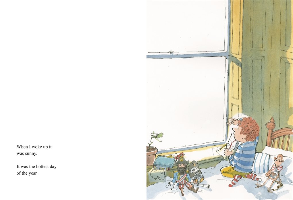
But while the boy has to wait patiently for his grandfather to be ready in Snow and Rain, this time Grandad is ready to go and enjoy the beautiful day straight away, picnic in hand. And what an adventure this turns out to be: crossing the hotest desert, coming across treasure-hunting and very hungry pirates whom they share their picnics with. Some clues as to what is to come are in the first double-spread (above) for little eagle-eyed readers to spot. The touching complicity between grandfather and grandson is at the heart of the series, and this is just a regular day for them. There is something a bit Come Away from the Water, Shirley – esque about these stories: celebrating how play and a little bit of imagination can brighten and transform any potentially mundane activity into glorious adventures. The only difference with John Burningham’s classic picturebook is that here, the adult is included in the fun, contrary to Shirley’s clueless parents.
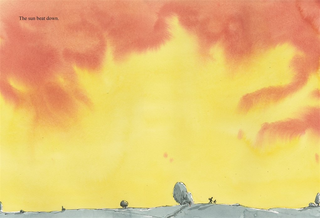
Reviewers have often compared Sam Usher’s artwork to Quentin Blake’s, and this is definitely so in the way he draws his characters; but what stands out for me in this series is his talent for watercolours and for using negative space. The use of negative space was very much apparent in Snow; teamed with the large format of the picturebook, this allows for fabulously scaled landscapes in Sun, which also displays his use of watercolours with great effect:
Usher’s work is a picturebook enthusiast’s dream, a perfect example of illustration as fine art. If someone had the audacity to tell me that picturebook art is not ‘real art’, this series would be among the books I would shove into their hands.
Going back to the us of space in the artwork, I have always been fascinated by the covers of the books in the sequence and their similarities, and wanted to ask Sam a few questions about how they came to life.
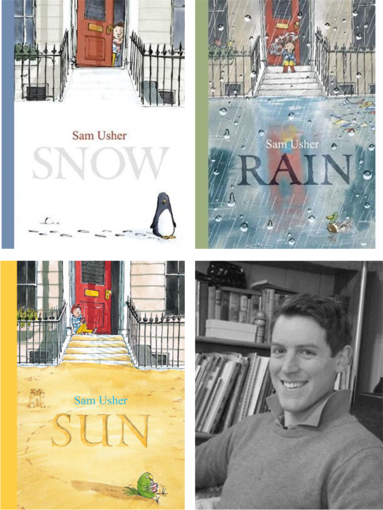
Hello Sam, and welcome to Library Mice. Many thanks for agreeing to answer a few questions and share the covers of the trilogy with us. I have found the covers really striking, not only because of the artwork, which I’ll get back to in a moment, but also because of the format. What is it your idea to go for a large portrait format?
The answer to this is quite boring: because I like it. It allows me to do tall drawings, which I prefer, as they allow me to fit in a lot of the background and architectural detail. The character, and what they’re doing, can be in one half of the picture, and the other half can be full of other incidental details, that perhaps tell another story.
This leads me nicely to the next question. Each cover follows the same format: the boy at the top of the stairs – in the top half of the cover, and in the middle (creating a position of strength and power, according to Moebius*), then the bottom half of the cover represents the season (with the title), and finally a bird on the bottom right. Can you tell us a bit more about how this format came to life?
I’m afraid I don’t know anything about theory — I just try to do what feels instinctively right. I wanted something serious looking, and classical in proportion – though I’m not sure it strictly is. I like the idea of being traditional, but subversive. In this instance, a cover based in rectangles and golden section, but sticking funny little characters it.
I appreciate your honesty, and I think your reply highlights the disparity between the way illustrators create and see their art and the way academics dissect it, which I find really interesting.
Can you tell us a little bit more about the birds? Moebius would say here that the bottom right is a position of weakness, but actually I see the bird characters as a promise of adventures to come, positioned right in the corner where we tend to grab the book to turn the page, and therefore start the adventure …
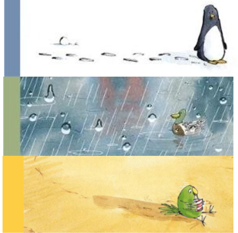
I put the birds in because I like birds. At first I didn’t know it was a series, so the penguin was a way of showing that the blank white page wasn’t blank white, but was snow. Adding a character and footprints made it a 3D space rather than a bit of blank paper.
I chose a bird that seemed to suit the seasons… penguin for the winter, duck for the rainy spring, parrot for the hot summer, and probably an owl for the dull, brown, windy autumn.
Hopefully the details entice people to pick up the book and hint at what’s inside.
Thinking about about viewpoints, the reader is positioned as if looking from across the street, possibly at the bottom of similar stairs that we can see the boy sitting at the top at. Why did you decide on this particular viewpoint?
Funnily enough I don’t think of it as a real viewpoint – it’s a semi abstract mishmash of features cobbled together to squeeze everything into the frame.
The cover of Rain is particularly striking artistically, your use of watercolour beautifully conveying the reflections in the rain water; you created many versions of the cover however, and toyed with the idea of doing a different type of cover, though keeping the same viewpoint. These show the boy looking out towards us from the inside, through a window, but also includes the shadow of the grandfather, who does not appear on any of the covers. Could you talk us through this idea, and why it wasn’t chosen in the end?
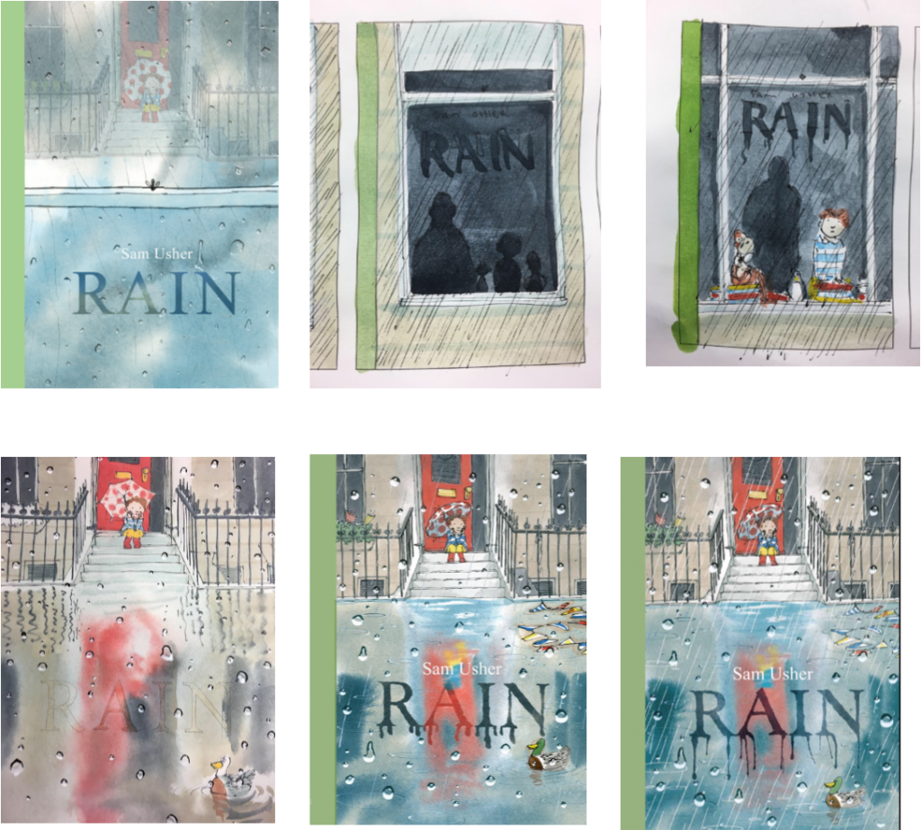
The rain cover was the most difficult — hence the attempts at a different design. The problem was that it was very brown, which we didn’t think would be very appealing. Luckily the designer came up with the masterstroke of imagining we were viewing the house through the window of a house across the road… so we could put in those rain drops.
Those magnificent embossed raindrops are really effective at giving readers the feeling they are looking through a window, or lens, rather than the cover of a book. How did you come up with the idea?
I am pleased with the raindrops, I think I was on a London Bus in the rain, or in the shower, saw how the water ran down the windows, and decided to copy it.
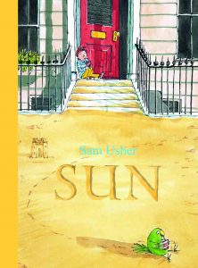
While the cover of Rain has embossed raindrops, the cover of Sun including spots of glitter, which emulates the feel of sand reverberating sunlight . The cover of Snow is smooth, however. Is this design choice or did the idea of having a ‘touchy feely’ cover come later?
 At the time we made Snow we had no idea there would be a series, so we just did what we thought was most effective. The fact that on the hardback edition there’s no lettering — just the outline of the letters in the snow — is pleasingly tactile and simple.
I’m not always a fan of cover treatments – especially glitter! – so the sun cover took a lot of persuading. I think it works quite nicely. Now I wonder what we’re going to do for the autumn book….. probably something with leaves blowing about…
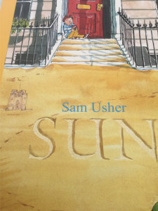
Finally, the first version of the Sun cover does not include the sandcastle. Why was that change made?
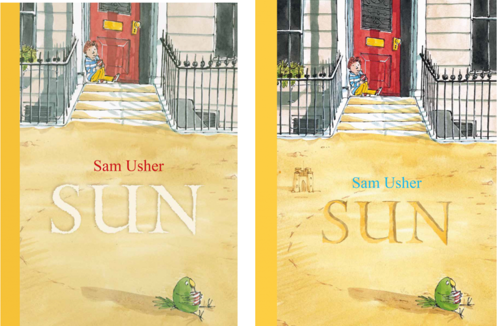
This was just to help a bit with the composition/layout — just a little point of interest in an empty area. Also, it’s a way of saying THIS IS SAND, just in case…
Thank you so much Sam. I have absolutely loved poring over these three books and the covers are some of the most striking I have ever come across. And thank you for the little snippets of information about what we can look forward to with the autumn title. I very much look forward to discovering it.
****
Sun is out now and you can buy a copy here.
You can find Sam Usher on Twitter: @SamuelUsher
All artwork © Sam Usher.
Source: review copy
* Moebius, William. “Introduction to picturebook codes” in Hunt, Peter (ed). Children’s literature: the development of criticism pp.131-147, London: Routledge, 1990.


[…] Library Mice – The creation of the Snow, Rain and Sun covers […]