 Poppy Pym and the Pharaoh’s Curse (Scholastic) is Laura Wood’s début children’s novel, for which she won the inaugural Montegrappa Scholastic Prize for New Children’s Writing in 2014.
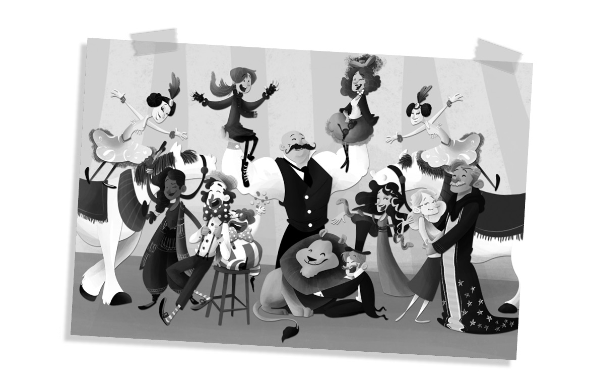
It tells the story of a little girl, Poppy, who was brought up in a circus after being abandoned there as a baby. But as she grows older, her adoptive mother Pym decides Poppy must join the ‘real’ world and sends her to a boarding school, Saint Smithen’s, where Poppy must navigate social rules and situations she has never encountered before. And if this wasn’t difficult enough, the school is about to host a huge exhibition of Ancient Egypt artifacts. And with this comes an ancient curse … Can Poppy and her newfound friends solve the mystery?
Poppy Pym and the Pharaoh’s Curse is a great adventure story with plenty of action and some really quirky humour thanks to Poppy’s extended circus family. Its mixes several genres (school story, mystery, and a sprinkle of magic) which appeal to a huge variety of readers. The text is very accessible to younger readers, particularly with the addition of illustrations by Beatrice Bencivenni. It is a great introduction to the boarding school mystery genre, after which readers might want to try Robin Stevens’ Wells & Wong series.
You can find it more about Laura Wood on her website and on Twitter @lauraclarewood.
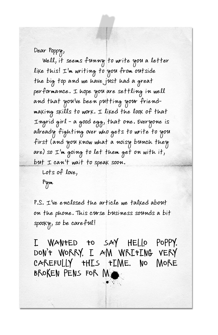
One of the really exciting features of Poppy Pym is the design involved inside the book, not only with illustrations but also different fonts, newspaper excerpts etc and I was delighted to be given the opportunity to ask a few questions to the book’s designer, Samuel Perrett, as part of the blog tour:
When creating a book cover, how do you decide which design you are going to go for, as I can imagine the possibilities are many?
The design process for our book covers start with a brief; this means I know who I’m designing the cover for and what (we hope) the reader will think when they see it. So with Poppy Pym, we wanted a bright, fun design that conveyed the notion of circus and school life. From there concepts are devised, an illustrator is commissioned, and it then becomes a collaboration between the designer, the editor and the sales team to make sure we are all in agreement that we have the right cover.
Do you design several covers to eventually narrow it down to one?
Yes, I would design a few different covers all that explore different compositions, different aspects/concepts of the story and even different branding. At times it can be like solving a puzzle and taking all the best bits from different covers to create the one that is perfect. When the final cover is created, you can often look back at the other designs and see just how the ideas have developed.
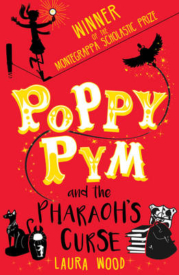
What inspired the colour scheme for Poppy Pym’s cover, which is quite bold?
I took inspiration from the themes of the book for the colour of Poppy Pym. Nothing says ‘Egyptian’ like gold foil and it married so nicely to the bold red of the circus tent. Again, part of the brief I had was for a ‘bright and fun’ cover, so a bold block of colour fit the bill brilliantly.
And what prompted you to use silhouettes?
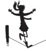 One big aspect of the book is the mystery that Poppy, Kip and Ingrid get tangled up in. Visually speaking, using silhouettes is a good way to keep the cover graphic whilst suggesting something mysterious. This also helped to ‘stay on brief’ and keep the cover bold and immediate by contrasting the black against the strong red background. I must not forget to mention how well the illustrator’s artwork worked as silhouettes in addition to her wonderful greyscale illustrations on the inside.
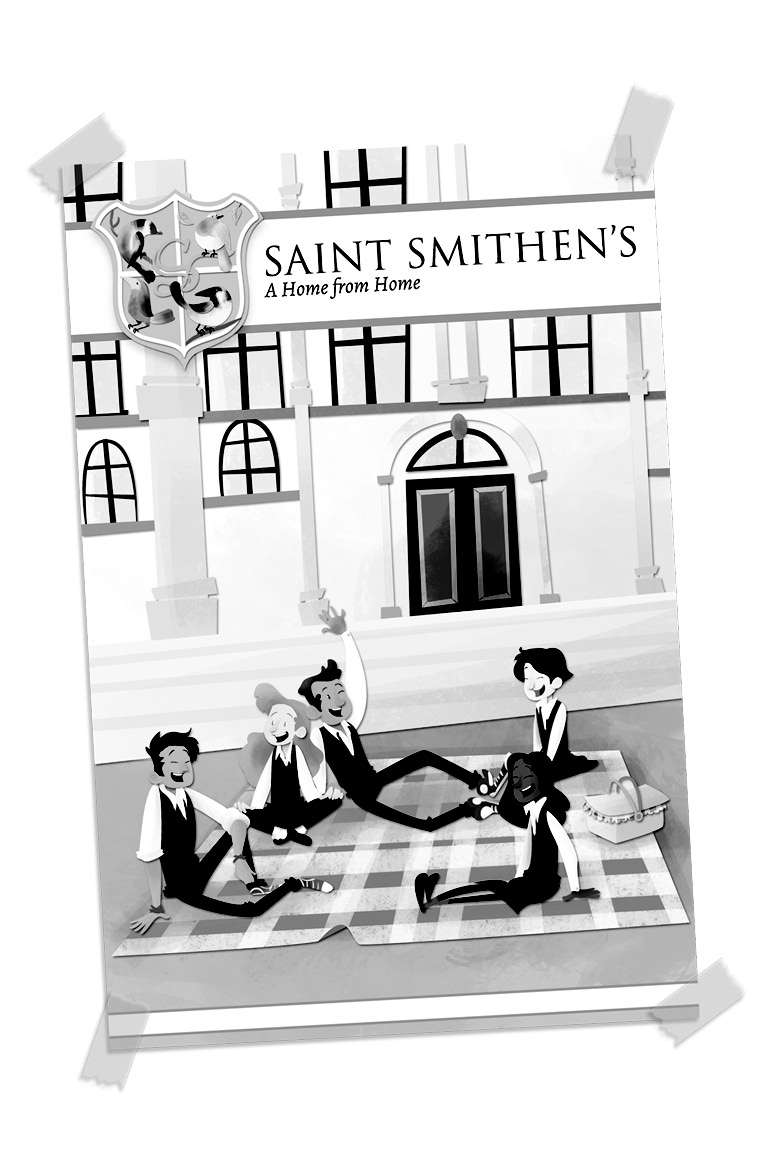
One of the things I enjoyed about Poppy Pym and that I think young readers will enjoy too is the different text designs within the main text, whether it is hand-written notes, newspaper articles or the transcript of telephone conversations. What challenges does this bring for a designer?
I really enjoyed these personal touches too, and even though they sometimes take more time than you might think – it’s completely worth it. It’s always fun to be able to stop and think about who the character is, or wonder what would that look like in Poppy’s world. I find it really helps to bring the characters to life and I hope the readers do too.
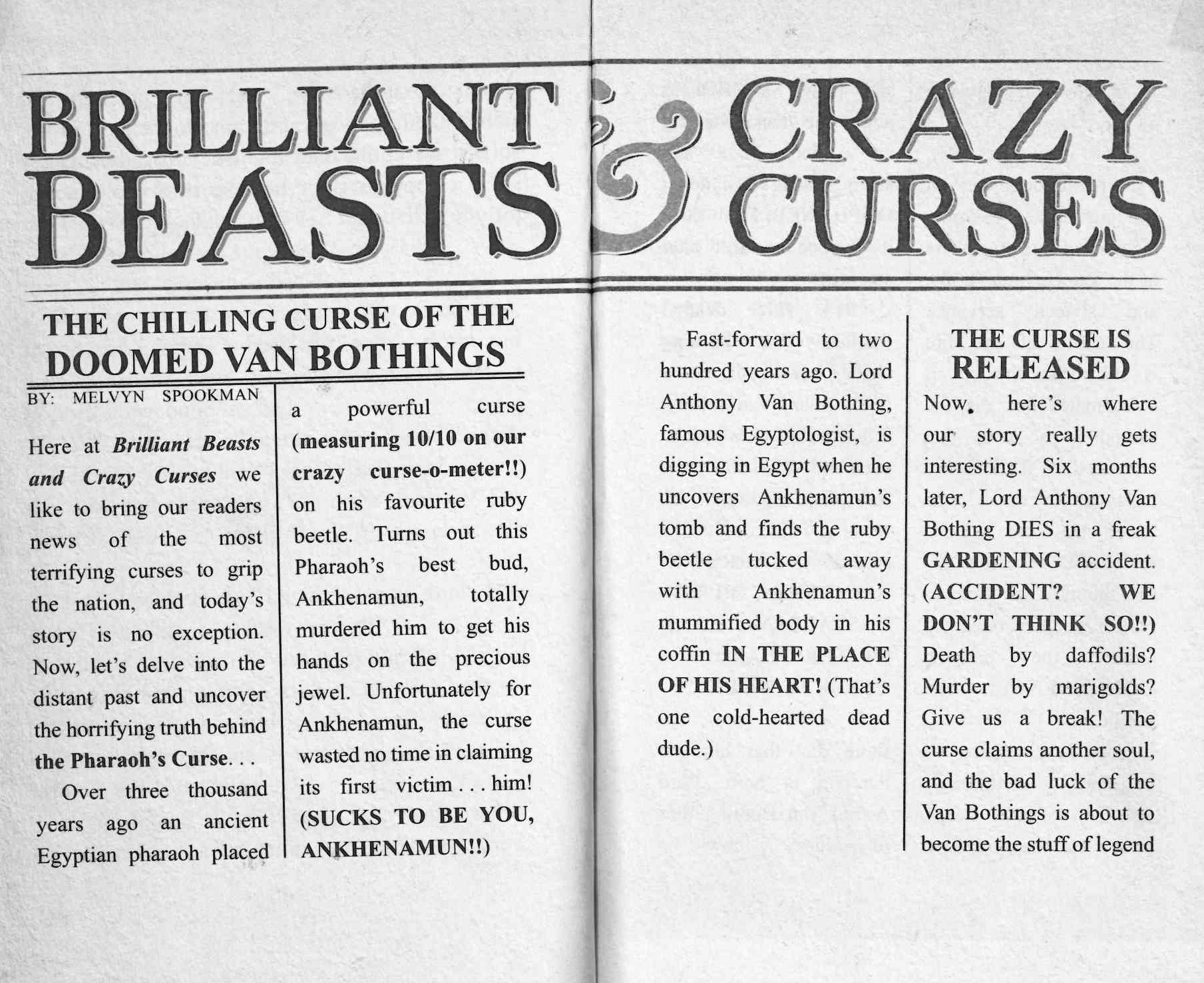
One of the challenges I faced with the insides of Poppy Pym was finding the right typeface for each character. This means thinking about how a character would hold a pen, such as Boris who is so muscular and strong that the pen doesn’t fit in his hand; nor does he know how hard to push – this means his writing is large and clumsy (and results in him breaking the pen). Or like how Fanella is in such a rush she makes Luigi scrawl down the page as she whips the paper from his hands to tell Poppy her side of the story in her bouncy lettering. Both of these examples contrast nicely against Madame Pym and her gentle, patient cursive handwriting.

It was so much fun to work on Poppy Pym and help bring Laura’s wonderful characters and their world to life; can’t wait to see what other adventures happen in book 2!
***
Thank you so much Sam for taking the time to answers these questions!
Poppy Pym and the Pharaoh’s Curse by Laura Wood with illustrations by Beatrice Bencivenni is published by Scholastic and is out now!