 We have always been fans of Ed Vere’s work in the Library Mice household. I remember my mouslings coming out of a Mr Big event at Bath Children’s Literature Festival clinching their own drawings of Mr Big with sheer delight.
What I have always particularly admired with Ed Vere’s work is how his deceptively simple drawings and bold use of colour come together to create such rich narratives, which are fun, heart-warming but also often quite poignant too.
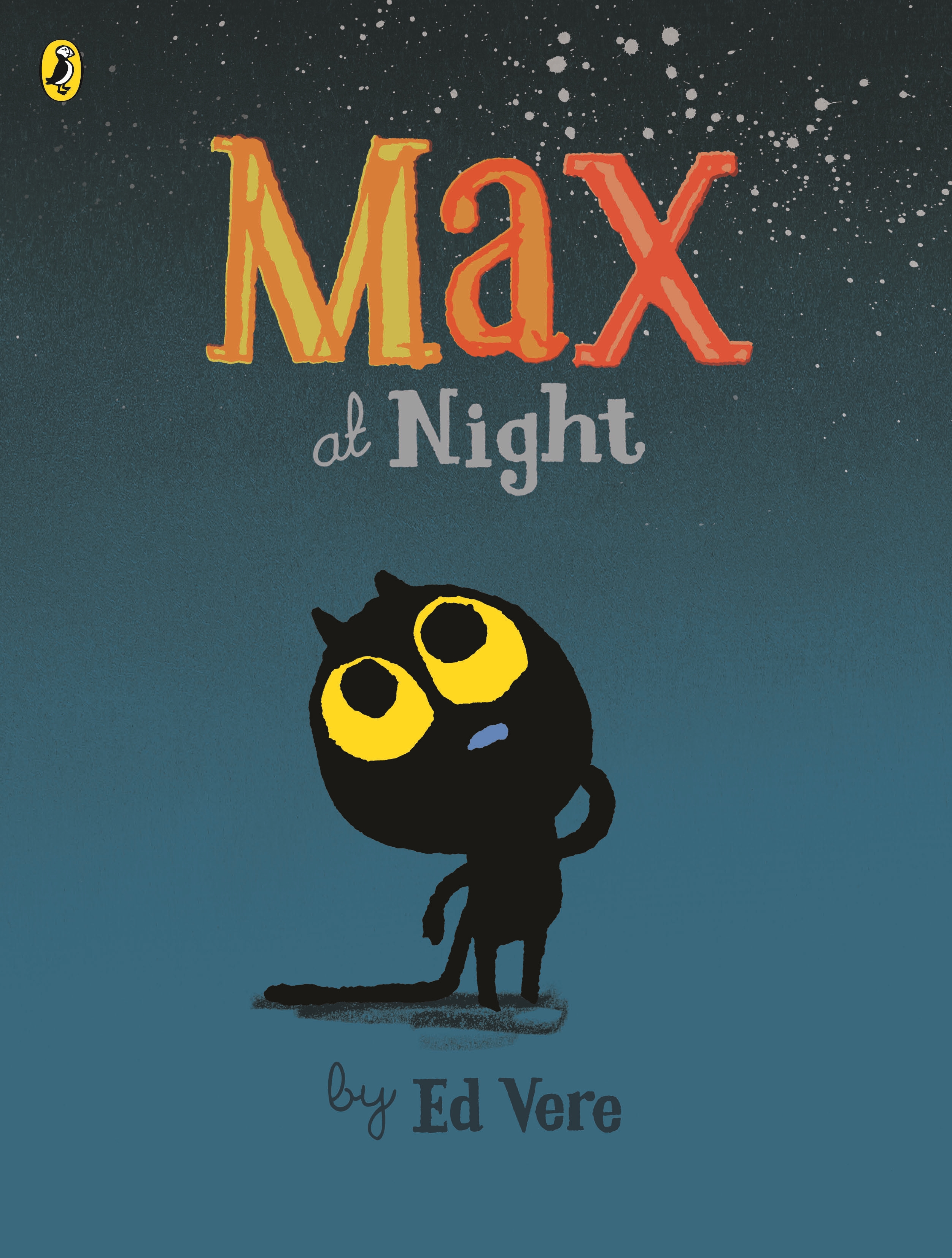
His latest book, Max at Night (Puffin) is no exception. This is our second encounter with Max the kitten, which we first met in Max the Brave:
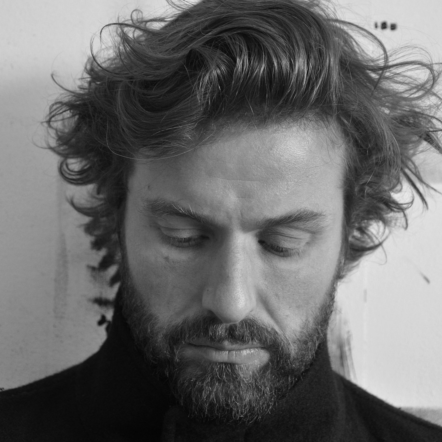
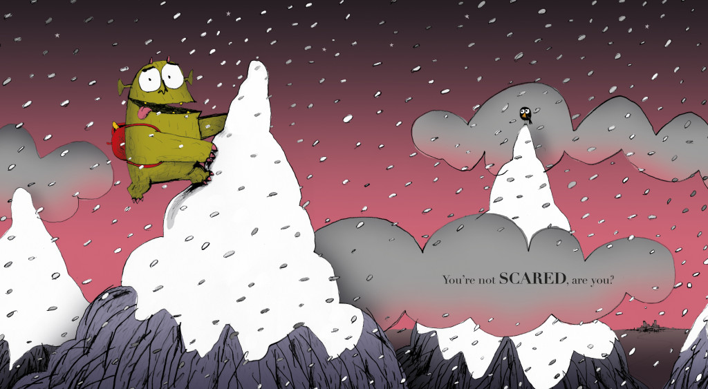
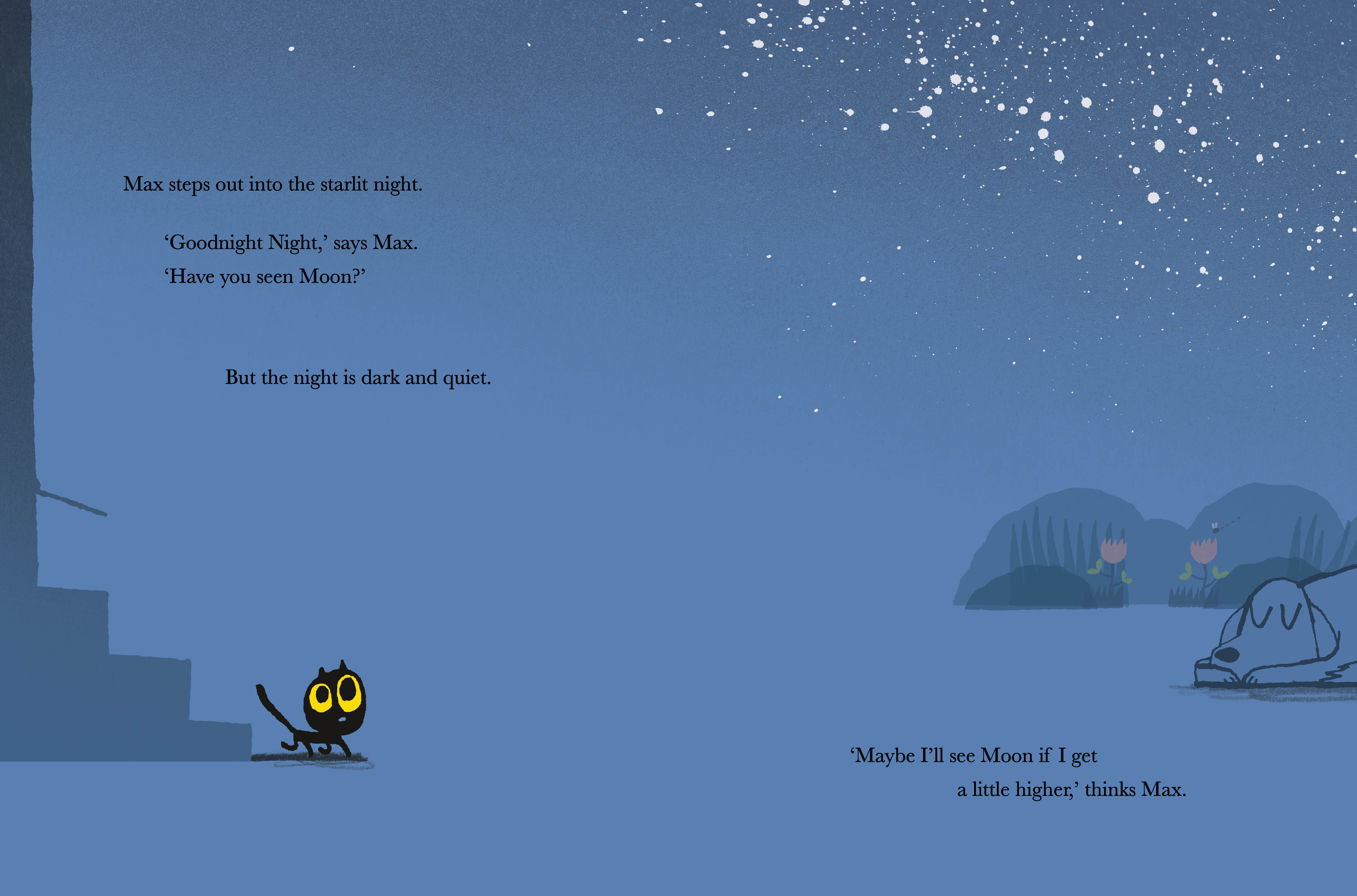
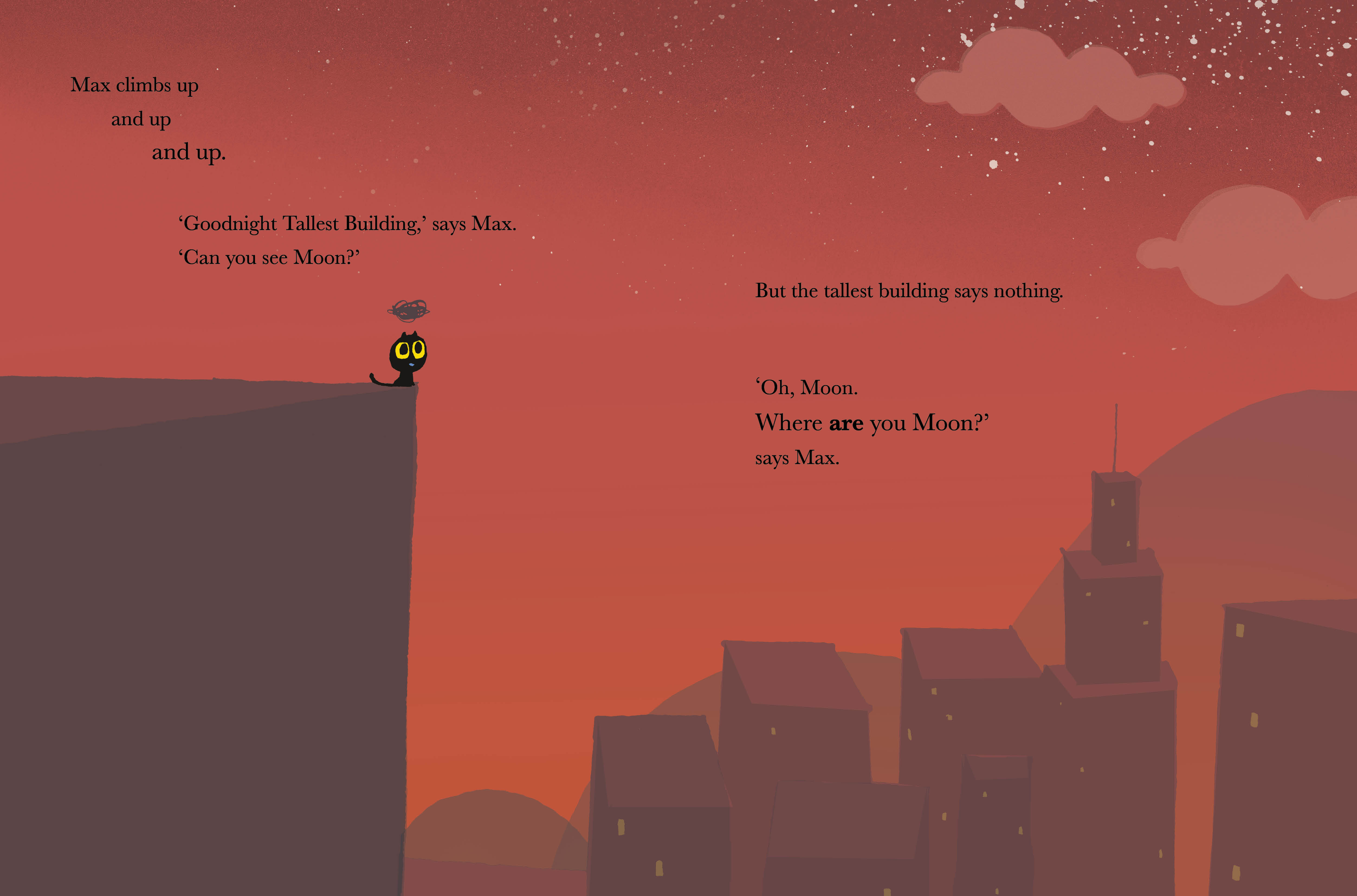
In Max at Night, we follow a sleepy Max as he goes along his bedtime routine; it seems Max can’t go to bed until he has said goodnight to everyone. But tonight, the moon is missing and before he can rest Max must undertake a long and increasingly perilous journey to find her. Ed Vere’s use of colour is particularly striking here in his depictions of the sky at night, and I was delighted when he agreed to talk about his use of colour and inspirations in this blog post.
My use of colour and other colourful inspirations
by Ed Vere
Why do I use such bold colours? That’s an interesting and difficult question to try and answer. Difficult because it’s hard to make sense of what feels like a natural instinct. Which is how I make so many of these ‘design decisions’. I may rationally decide that I want a book to be simpler or more complex, to illustrate in a looser & busier way with a pencil (Bedtime for Monsters) or to take a simpler graphic approach (Banana or Max the Brave & Max at Night). But when it comes to colour, it feels like it dictates its own rules. Very obviously, children respond to simplicity and with books for the young, in simplifying the environment you allow the focus to rest on the character and their action. Along with simplicity of layout, simplicity of colour follows. I choose colours that emotionally relate to what’s happening in the story… that’s an emotive and instinctive decision… one of those ones you work out by feel rather than rationalising. I’m not massively analytical in my approach because it feels too dry… I prefer to be led by my instincts and what feels right. And, I love big expanses of juicy colour.
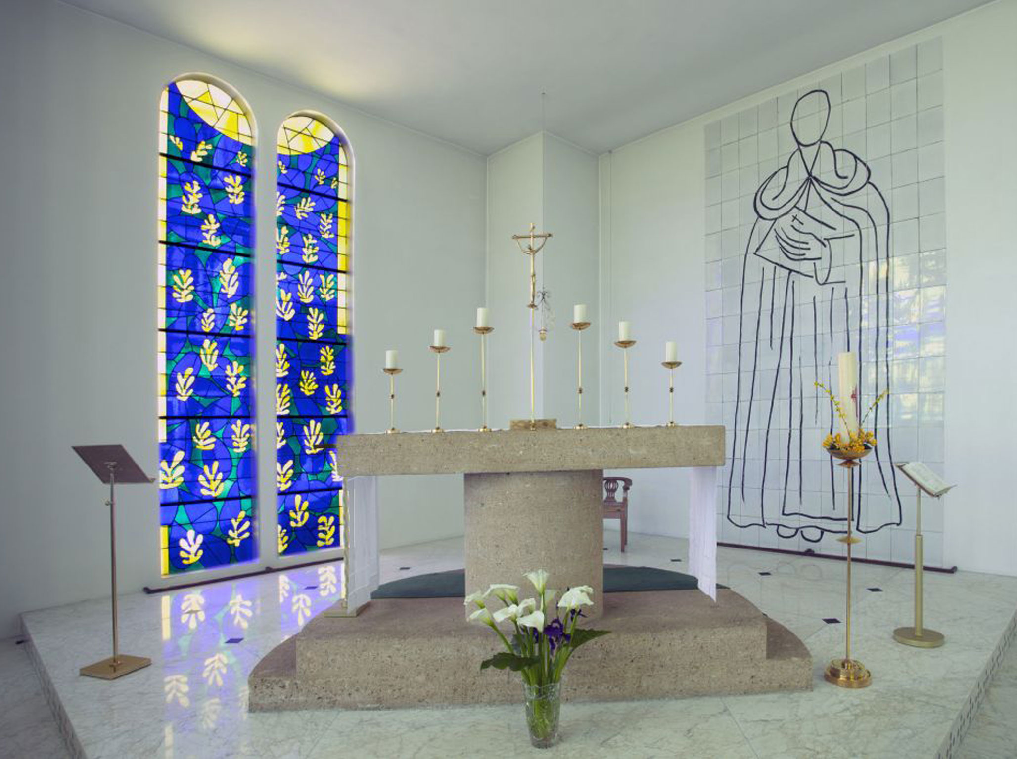
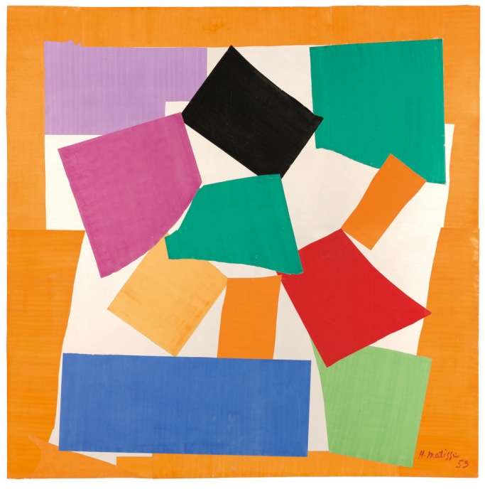
There are so many artists whose colour sense I love… right up at the top is Matisse who seems to naturally filter joy, peace and understanding through colour… I don’t know how he did it but it’s a kind of genius that few can emulate. His Chapel at St Paul de Vence is an incredibly beautiful place… All of his work, really, is incredibly exciting for me. I think it sums up an approach to, and feel for life. It’s like a feeling for music, impossible to successfully sum up in words. His recent Cut Outs exhibition at Tate Modern was completely inspiring… not least because he managed to make his ideas accessible to so many people.
Other artists… Paul Klee, similarly joyful and endlessly curious; Ellsworth Kelly, an incredibly spare colourist with a truly stunning sense of harmony and balance; Tomi Ungerer (Three Robbers), he creates incredible evocative and complete worlds with his use of colour.
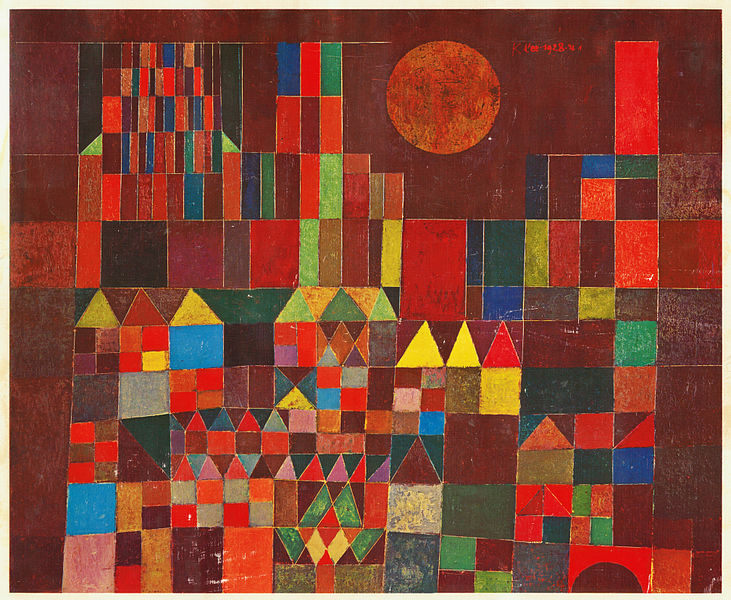

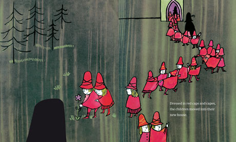
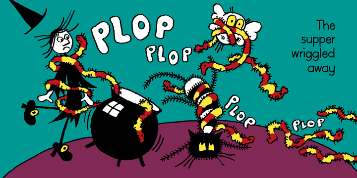
Jan Pieńkowski, his very spare and bold colour schemes completely draw me in… they feel simple, but they manage to create completely believable worlds in which to exist. I always find it amazing how an abstract two dimensional drawn/painted environment can become a living breathing world for the imagination; Chris Haughton… He’s a friend so I should go easy on the praise… But he does have an amazing colour sense. I love the way he’s created such distinct identities for each of his books through a limited but stylish palette. He’s got such an incredibly good and sometimes surprising colour sense. It feels simple… But is extremely hard won. I’m sure people have no idea how much work goes into them.

Colour is massively important to the way I work… It’s a way of conveying emotion, of joy, exuberance, melancholy, and everything in between and beyond. A subtle way of putting those emotions on the page without being too heavy about what you want to say… Or sometimes a completely unsubtle way of doing it and making a foghorn statement of intent. It’s hard to describe it and not sound like an idiot, but you can think in colour, and I think children understand that innately.
***
Thank you so much Ed for this fascinating post. You explained perfectly how your books affect us, because the colours do make us ‘feel the story’.
You can find Ed Vere on Twitter and Instagram. Check out his website also.
Max at Night is published by Puffin and is out now.