Until this coming Friday (24th September), members of CILIP can nominate titles to put forward for the 2022 Carnegie and Greenaway medals. In order to be eligible for the 2022 Medals, books:
– must have been published in the UK or Ireland between 01 September 2020 and 31 August 2021.
– which have been first published in another country, must have been co-published in the UK or Ireland within three months of the original publication date (unless it’s a translation)
– must be written in the English language (either as an original work in English or a first English translation of a foreign-language work) and specifically published for children and young people.
– may be co-authored but not be multiple author/illustrator anthologies
– may be poetry, non-fiction and graphic novels, in print or ebook format.
But what about the criteria? What should people consider before putting a title forward for nomination?
I think people feel often less comfortable about nominating titles for the Greenaway Medal because they have no artistic background, or don’t feel they know enough about illustration. The criteria (which can be found here) offer a useful framework as to what to look for but are not there to be followed rigidly, they are not a “tick list”. What people should look for in a picturebook is an outstanding reading experience.
The book that wins the Kate Greenaway Medal should be a book that creates an outstanding reading experience through illustration. The whole work should provide pleasure from a stimulating and satisfying visual experience, which leaves a lasting impression. Illustrated work needs to be considered primarily in terms of its graphic elements, and where text exists, particular attention should be paid to the synergy between the two.
Preamble, CILIP Kate Greenaway Medal criteria
Here are a few examples of outstanding practice which enhance the reading experience, taken from some of the titles shortlisted for the 2021 awards.
Artistic Style
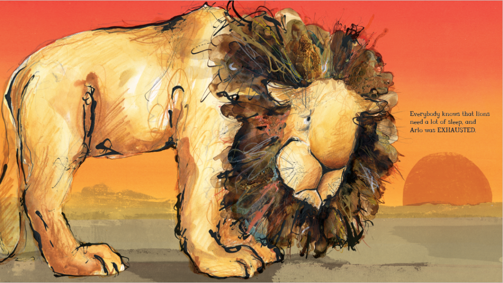
The use of line, material and colours here are outstanding at conveying the physicality of the mane: thick, tangled, a little dirty. tArlo’s presence is big in the foreground, taking most of the page, emphasising his feelings. In the background, the colours used and the brush strokes the radiating heat of the evening light.
Perspective
The perspective (where the reader is positioned) given in this double-spread is the one of the main character. We are positioned as her and therefore view the world as she does. This might limit our view as we are not positioned outside of the action, but it also allows us to be more in tune with her feelings, seeing life and her art through her eyes, therefore affecting our reading experience.
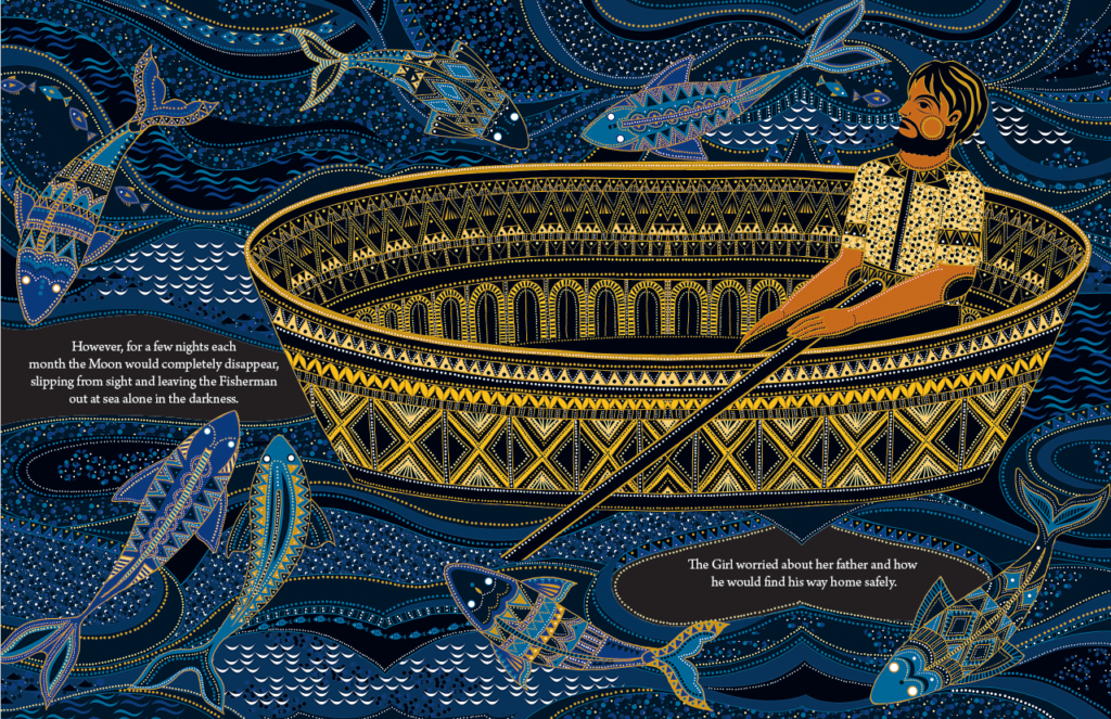
Gutter
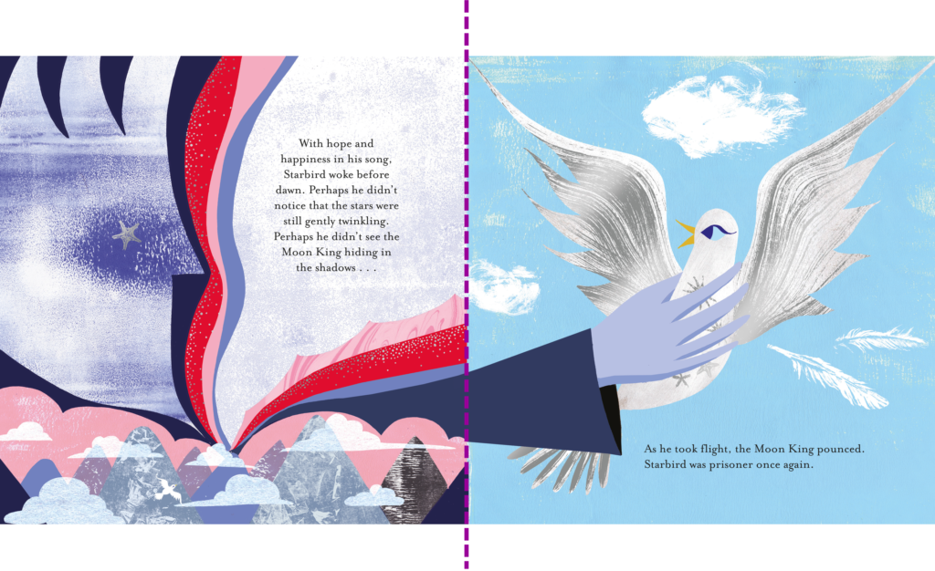
In this double-spread made of two single full-bleed illustrations, the crossing of the gutter is really impactful, conveying intrusion and a breaking of rules. This is amplified here by the different palettes in each illustration, as well as the fact that the illustration on the left is very busy, conveying chaos, while the one of the right includes a lot of space, which conveys serenity. Altogether these create the feeling of immediate danger and entrapment for Starbird, and the evil intentions of the Moon King.
Frames
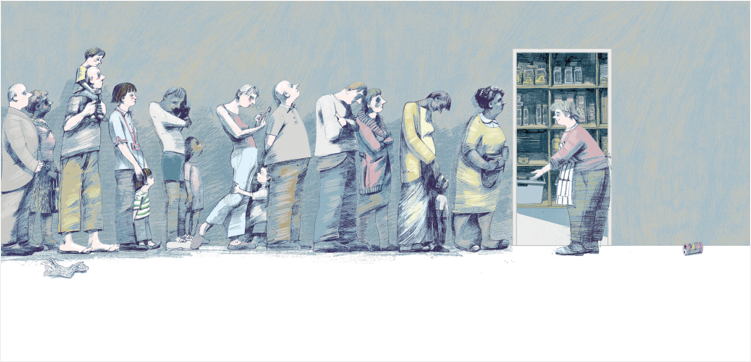
In this spread, the food is isolated from the characters by the door frame, which traps the food inside its frame, making out of reach for the people queuing. The volunteer is also trapped in the frame, but her hand is almost reaching out outside of it, creating a bridge between the two. The people are also trapped within the frame created by the page’s edge; note how plain the walls are, comparing to how busy it is inside the door frame. This amplifies the idea that the people queuing have nothing.
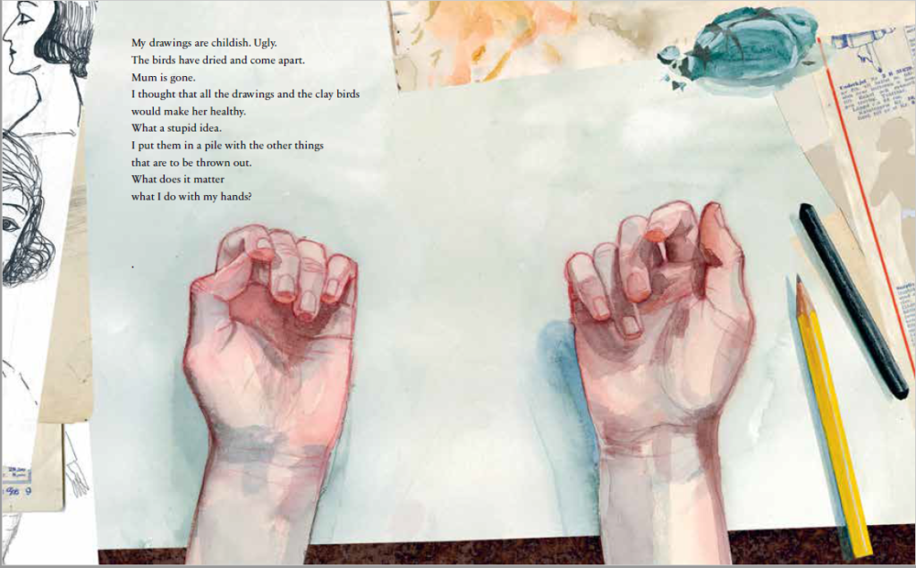
Positioning
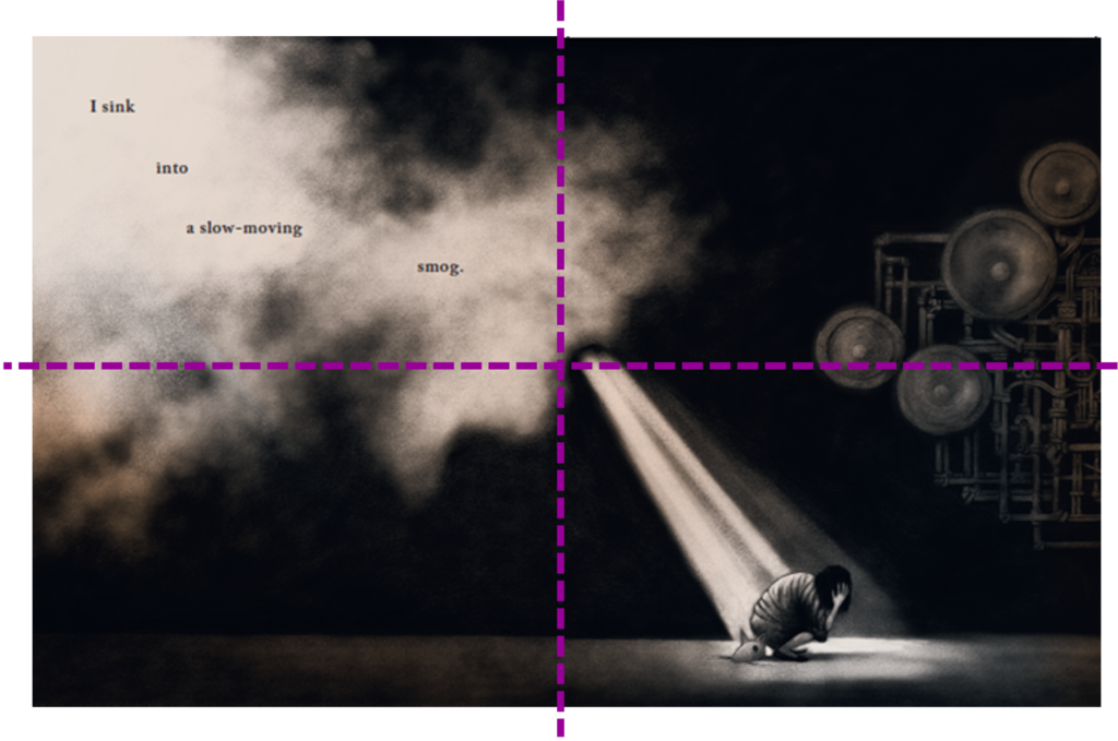
Here the feelings of the character are not only expressed by her demeanour and body language but also her positioning on the page:
Low on the page = low social status, low spirits.
Right side of the spread = less secure (moving forward beyond the page).
This is also emphasised by the use of light – the spotlight on the character makes it difficult for her to hide and escape from her feelings.
Lines
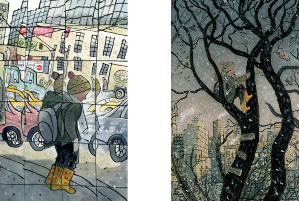
Lines within this book are particularly prominent and effective at expressing not only a sense of space, but also how the space makes the main character feels. Straight vertical and horizontal lines are used to create the urban setting and its closed, almost suffocating atmosphere, almost emulating prison bars at times. In contrast, the curves of the branches and the trees, representing the natural world, bring a sense of comfort and freedom.
Visual representation
Using inspiration from folk art around the world with a particular emphasis on kalamkari textiles, the style, shapes, patterns and colours are wonderfully in tone with the place and culture within which that the story is based.
Layout and pace
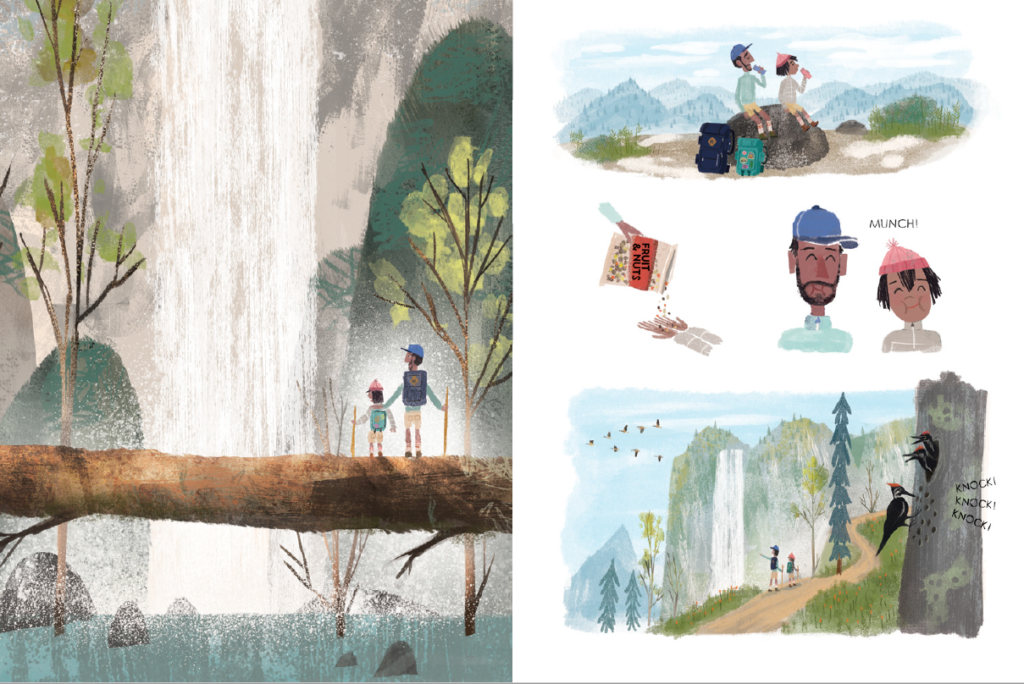
The layout in this book is particularly important because the book is wordless, therefore the story is conveyed and paced only through the artwork. The alternating, full bleed double spreads, single page full bleeds spreads and use of panels and vignettes allows a constant change of pace and focus for the reader. The large spreads slow the narrative while sequences of smaller illustrations quick the pace and help focus the reader’s gaze to specific details.
Here are a small selection of titles eligible for the 2022 Kate Greenaway Medal. You can nominate both your Greenaway and Carnegie titles here.