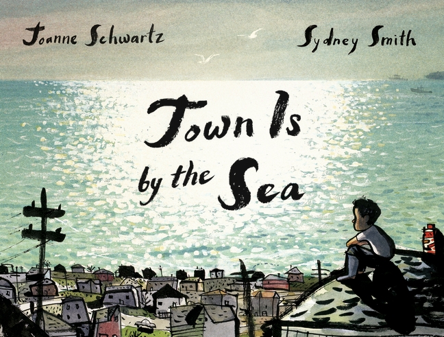
Joanne Schwartz (text) & Sydney Smith (artwork)
(Walker Books)
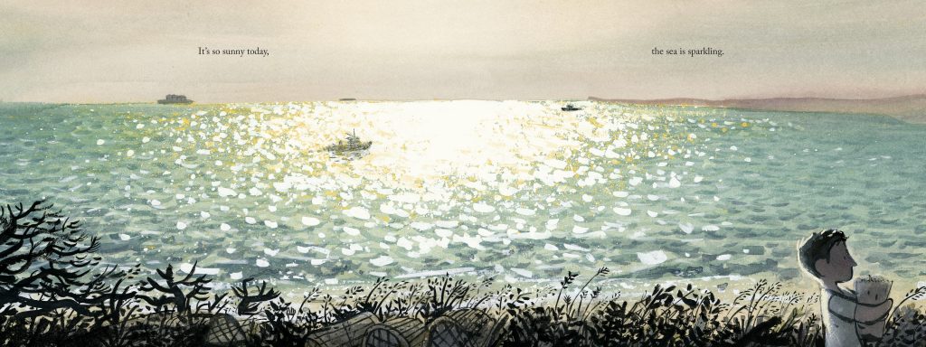
The story of Town Is by the Sea focuses on every day life in the coastal mining towns of Cape Breton, Canada in the 1950s and offers two contrasting narratives as a boy and his father follow their daily routines. While the child’s day is full of light and merriment, his father goes down to the mine under the sea bed to dig for coal every day. This is an unusual topic for a picturebook, and one would not necessarily consider a narrative focusing on coal mining to be lyrical. Yet this book is a stunning snapshot of a life that many readers will have no knowledge of, and highlights the fact that sometimes people have little choice when it comes to their paths in life. While the resigned tone of the narrator’s voice might sound utterly heartbreaking to us, there is at no point a hint of resentment, but rather a sense that it is the way it has to be. And while this is for the reader a rather haunting tale, it also highlights the beauty and happiness that can be found around us even when life can seem harsh. Smith focuses on the stunning beauty of Nova Scotia (visit Cape Breton Island and have a look at those stunning landscapes) and the fact that while his upbringing might be unique in the sense that it is so intertwined with the history of his hometown, the boy is nonetheless a boy like all the other children who might read the book. The melodic text reads beautifully and the colour palette is stunning; Smith’s work on conveying sunlight on the water is some of the most striking I have ever encountered:
He also plays with the sun and its shadows as a way to convey time passing:
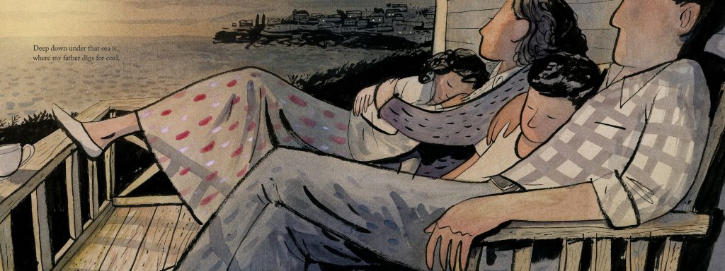
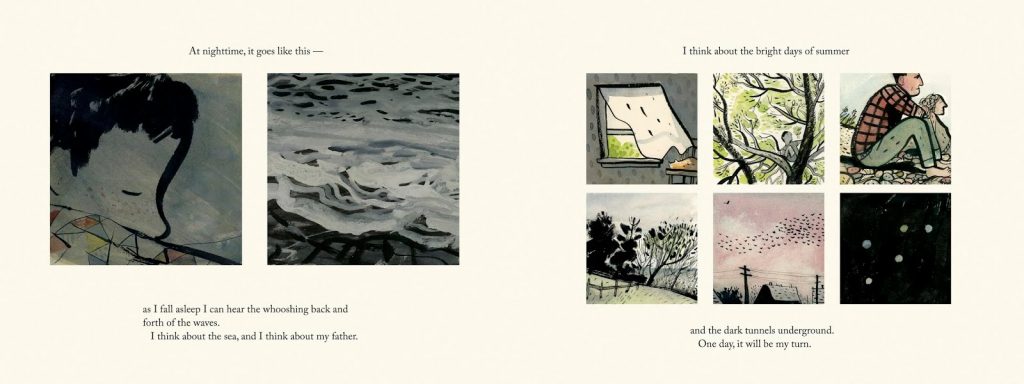
The orientation of the book is particularly pertinent here also. Using the landscape format reinforces the idea of movement and journeys within a narrative, and here emphasizes the idea that this is a snapshot of a day, with time passing by. Smith alternates different page layouts, from double-spreads to sequences of vignettes, playing with full-bleed and negative space, framed and unframed; these alternations allow the visual narrative to speed up, pause, open up, focus the reader’s eye. It is masterly done. But the text also highlights the idea that characters are trapped, forced to reenact the same pattern every day. This is done through the use of repetition, which emphasizes the unavoidable patterns of their lives. “It goes like this …” hints at a routine that cannot be escaped, while the fact the repetitions of “deep down, under the sea, my father is digging for coal” accompanying each underground spread emphasizes the inevitability of their livelihoods – there is no other option for the dad than mining, and neither will there be for the boy, eventually. This is what they do, and while happiness and love is certainly conveyed beautifully and candidly throughout, the tale does not shy away from darker themes; the mine is always present, even in the most tender of scenes:
The book leaves readers in a contemplative mood; it radiates a serenity, a beauty which might seem almost in discordance with its theme, yet it just works, perfectly.
Reading Town Is by the Sea several times, I noticed how it illustrates quite accurately some of William Moebius’ picturebook codes*, particularly in terms of positioning, line and framing.
Moebius considers that where characters are positioned within a double-spread hold a high significance:
“A character that is on the margin, ‘distanced’ or reduced in size on the page, and near the bottom will generally be understood to possess fewer advantages than the one that is large and centered”. (140)

This is obvious when looking at the underground double-spreads, where the miners are always shown on the bottom right, which emphasises the precarious state of their job.
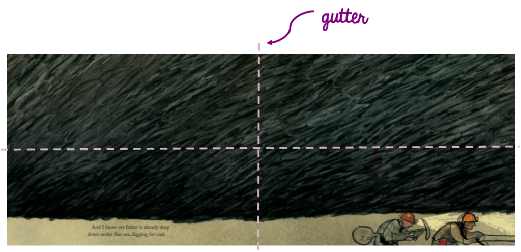
Only when the ground collapses do they cross the threshold of the gutter back towards the left, moving counter-flow of the narrative, back towards safety, yet still at the bottom of the page, so never completely out of danger:
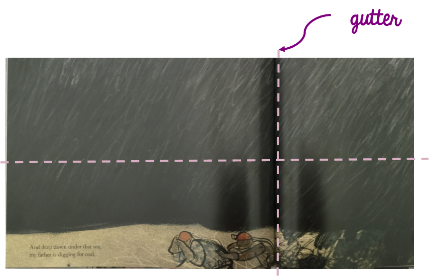
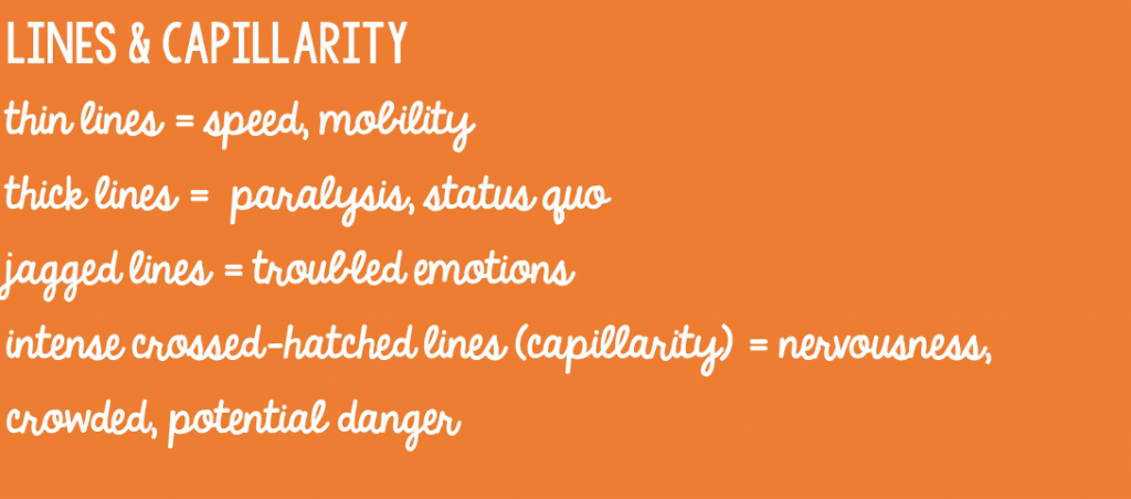
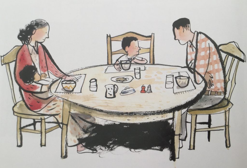
The code of capillarity is demonstrated particularly well in the mining double-spreads. The ground above the miners is thick with lines, conveying danger. Moebius explains this by saying that it is “as if each line was a living organism” (142), which again is really well conveyed in those spreads. This ‘living presence’ is also found under the table in the family meal-time illustration above, conveying that the mine and its dangers might be out of sight, but never really out of mind.

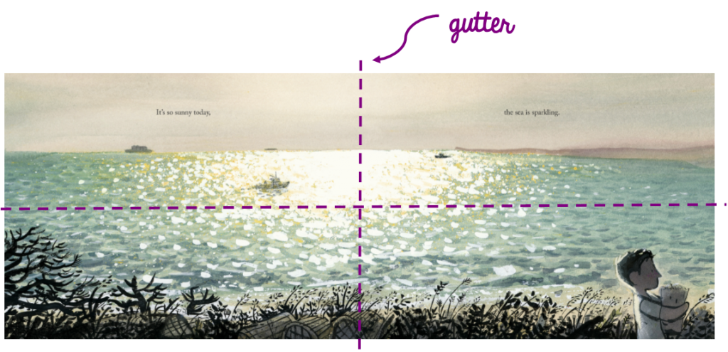
The use of full bleed/unframed illustrations is used throughout and is particularly striking in the ocean spreads, which open possibilities beyond the story and emulate the vastness of the ocean. Yet in this particular spread, the boy is still positioned in the bottom right, therefore a weakened stance, conveying that those possibilities are not for him, that his path is already traced.
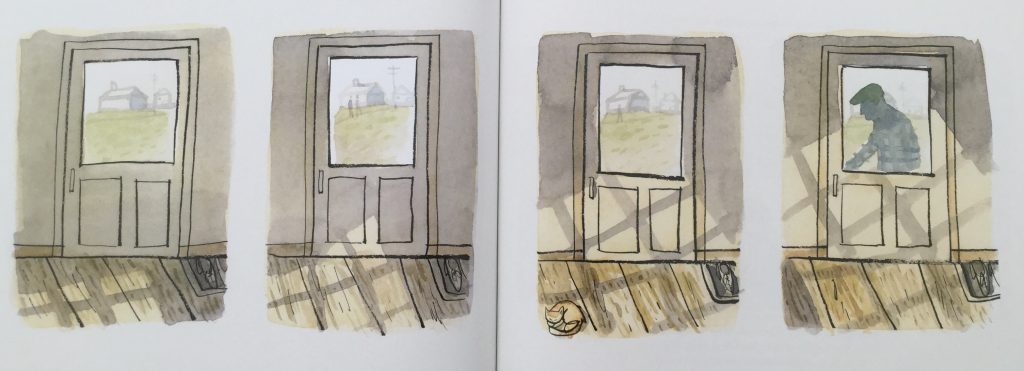
The framed illustrations appear in a variety of sizes and focus the reader’s gaze on specific yet seemingly, at first at least, inconsequent things, offering a snapshot of their every day life. The smaller framed illustrations are almost set as a family album.
The framing around the window vignettes above has a softer, more rounded frame. This could be taken as expressing the promise of what is outside the door (the ocean, but also the father coming home and therefore out of danger). Interestingly, there are a lot of windows and doors with Town Is by the Sea.
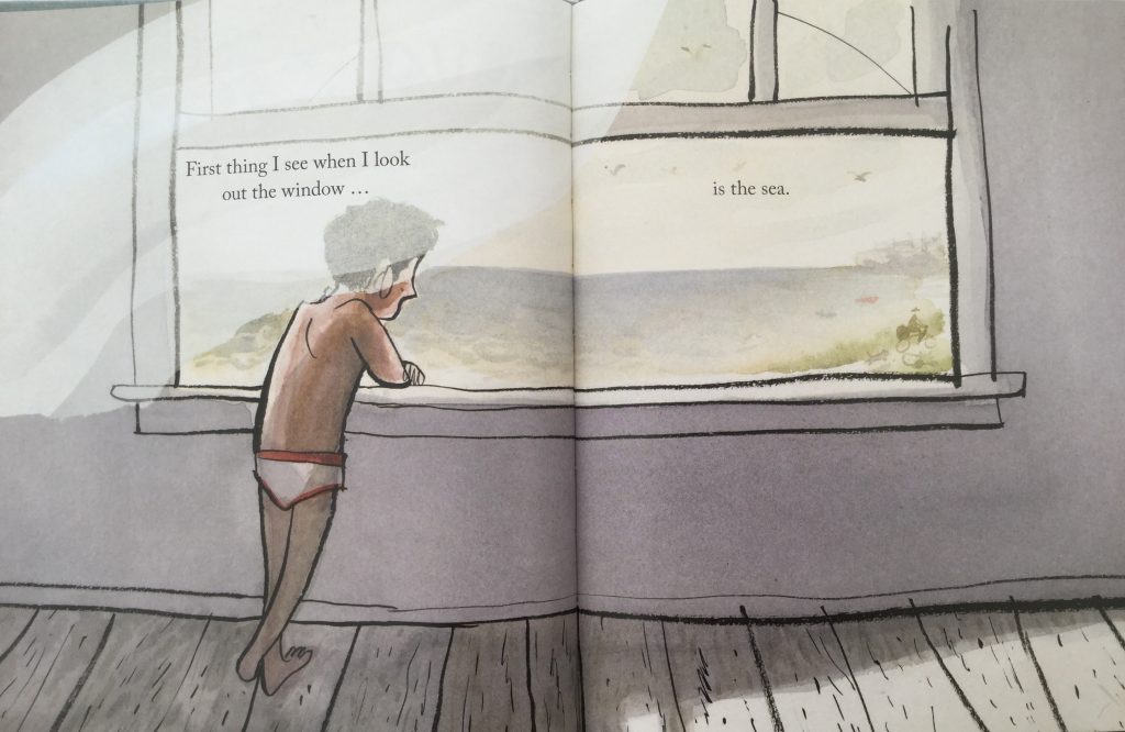
They are themselves frames of course, and are often considered as symbolic thresholds. In the illustration above, the sea is framed by the window pane. The boy says “First thing I see when I look out the window is the sea”; we get this limited glimpse within the frame, because the ocean is the only thing the frame is allowing us to see. As this is positioned at the beginning of the narrative, one can look at the threshold as being between the safety of the house and potential adventure. Yet, in hindsight, once the reader knows what the sea also symbolizes to townspeople, this threshold could be seen as between the safety of his childhood and the path that is his legacy.
These are of course, only my thoughts; the joy of reading is that we bring our own experiences and viewpoints to texts and artwork.
I must thank Megan Dowd Lambert whose wonderful book Reading Picture Books with Children prompted me to pick up my MA books again after a little a bit of a break. I had forgotten how much I enjoyed looking closely at illustration. I urge to get hold of her book.
All artwork © Sydney Smith
You can buy a copy of Town Is by the Sea here.
Source: review copy from publisher
—-
* Moebius, William. “Introduction to picturebook codes” in Hunt, Peter (ed). Children’s literature: the development of criticism pp.131-147, London: Routledge, 1990.