 Today I am delighted to be part of the book tour for the launch of Anne-Marie Conway’s latest book, .
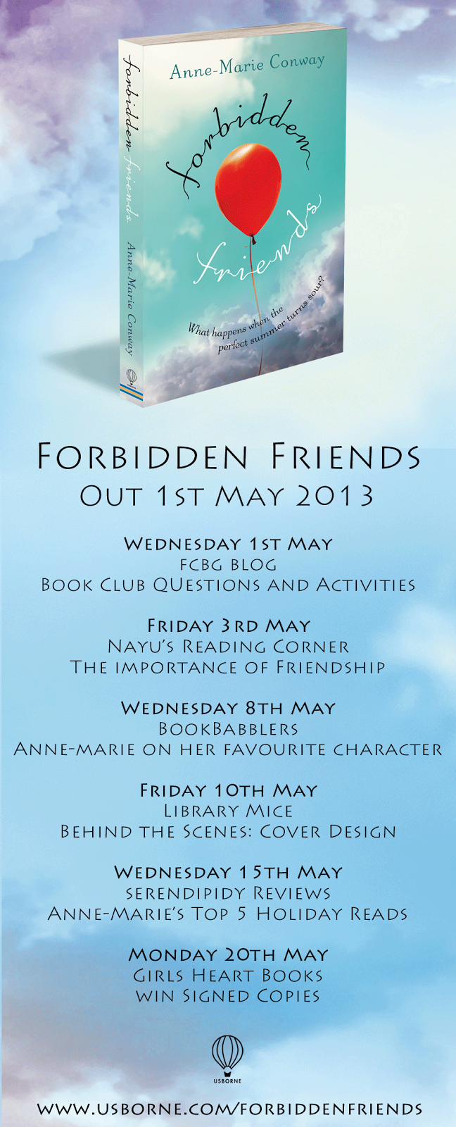
Forbidden Friends
Here is a bit more about the book:
Don’t be fooled by the sun and summer atmosphere, there’s a dark mystery at the heart of Forbidden Friends. When Lizzie and Bee meet on holiday, it feels as if they were always meant to be friends. As the two girls grow closer however, strange questions rise to the surface… Is Lizzie an only child? Why has Bee’s dad disappeared? And why, as the holiday comes to an end, are the two girls forbidden from seeing each other again? Could one dark secret from the past hold the answer? Could one fateful night keep Lizzie and Bee apart…for ever?
Also, in the last week it has been announced that Butterfly Summer, Anne-Marie’s first book, has been selected for Bookbuzz 2013.
***
Forbidden Friends: The Cover Story
Getting a cover on a book can be an incredibly daunting prospect. The cover needs to attract the right readership, say “pick me up and take me home” (or increasingly, “download me”!), it needs to convey something of the story, give a hint of the tone of the story – is it happy, sad, funny or whatever…and so on. What it can’t do is tellthe story.
In general, editors think in words, designers in pictures and getting the two to marry isn’t always easy. But out of that tension we hope comes a great cover.
When we first received the manuscript for Forbidden Friends we immediately thought of trying to produce a cover that tied in loosely with Anne-Marie’s previous bestselling summer scorcher Butterfly Summer. After all, we thought, the stories have a similar dark mystery at their heart and from a sales point of view it’s often good to create a look or a “brand identity” for an author.
But actually, after several attempts we had something that looked the same and not different enough, nor did it convey the very different setting of Forbidden Friends. We worried that we might confuse potential readers, not excite!
So it was back to the drawing board… Much of the story is set during a summer holiday on a Spanish beach. And summer holidays are always perfect…right? Well, no – not always, and certainly not for Lizzie and Bee, the two girls at the heart of the story. For each girl’s holiday is shrouded in adult secrets and lies. This time the designer started from the premise that a bright blue sky promises a perfect summer but then wanted to show the storm clouds gathering. A cover then needs a focal point and so the red balloon that features poignantly in the book was introduced as this central image, but also to suggest young, carefree summer days.
Typography is also critical and here the designer used lettering that looks loose and light but with a contrast of black and white which hints that all may not be quite right in these lazy hazy days of summer…
It’s a cover we’re very proud of. We hope it will excite and invite readers into Anne-Marie’s exquisitely woven story of hopeful new friendship and a terrible past tragedy.
Don’t miss the next stop on the blog tour over at Serendipity Reviewson Wednesday 15th May where Anne-Marie will be sharing her top 5 holiday reads, perfect for summer!

 Today I am delighted to be part of the book tour for the launch of Anne-Marie Conway’s latest book, .
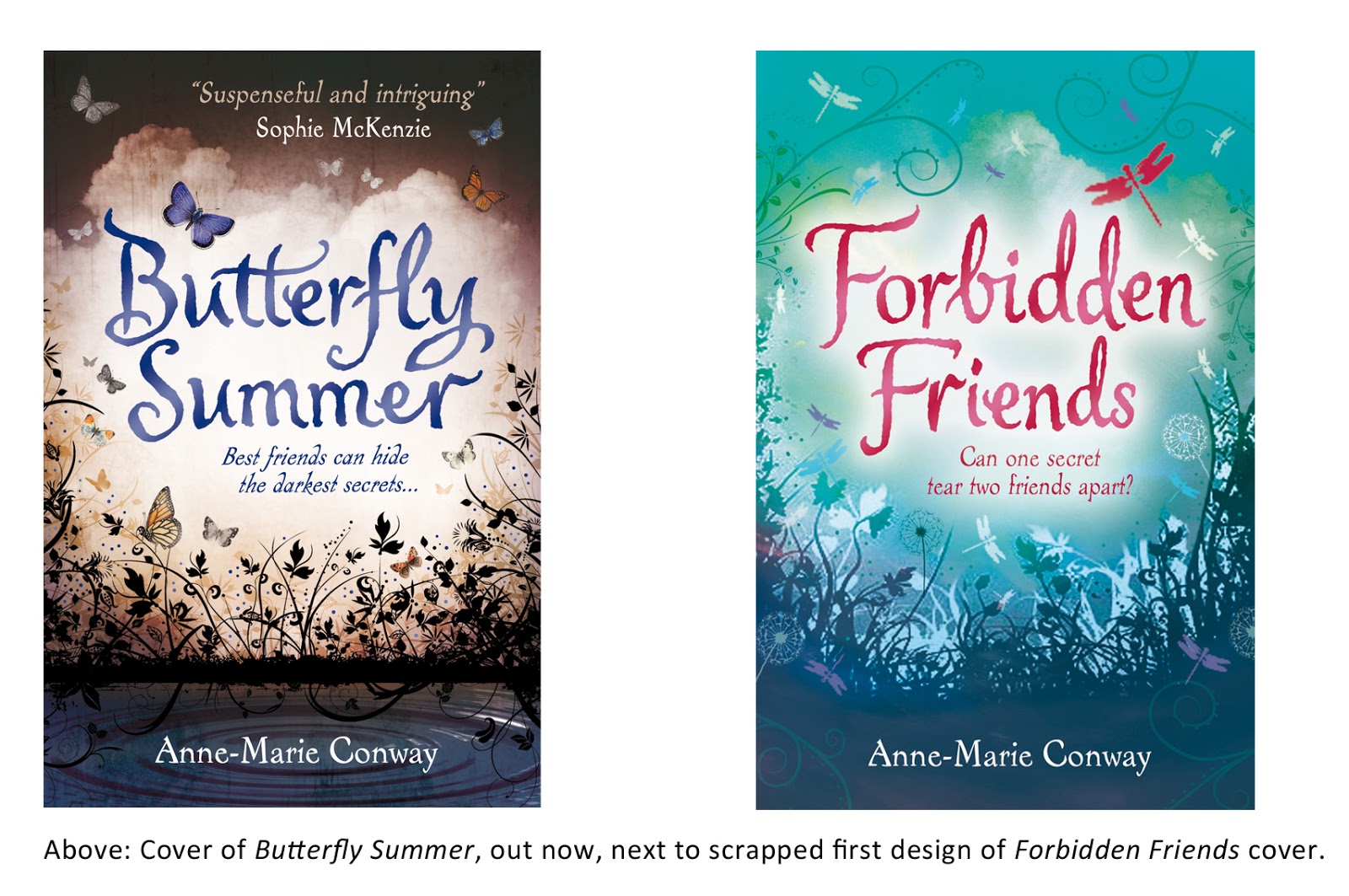


love the cover