Today is the last stop of the blog tour for Poppy’s Place: the Home-Made Cat Café, the first books in a new series written by Katrina Charman and illustrated by Lucy Truman and published by Stripes. The rest of the tour included a review from Readitdaddy, Katrina Charman’s Five Last Reads over on Serendipity Reviews, how SCBWI helped Katrina become a published author on Storysnug, and Katrina’s Top Five Cats in Books on Book Lover Jo’s blog.
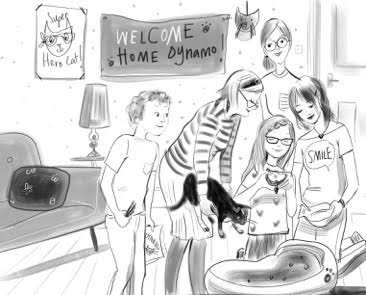
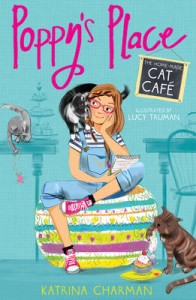 Poppy’s Place: The Home-Made Cat Café is a lovely new series about cat-mad Isla and her family. Isla loves cats and has had a hard time persuading her mum, a vet nurse, that they should adopt one. But the arrival of Gran who has come to stay with them for a while, and the fact that there is a lovely clever cat waiting for a home create the perfect opportunity for one more begging plea to which Isla’s mum succumbs, finally.
This first installment deals with some interesting themes: recovery after bereavement, family relationships, internet safety and self-consciousness to name a few. All dealt in a gentle and entertaining way, which will appeal well beyond cat lovers. It will delight fans of Holly Webb and Sarah Lean to name a few.
The artwork by Lucy Truman really helps create the fun yet safe atmosphere of the tale.
I was particularly interested to find out how Lucy came to decide what Isla would look like, and I am delighted she agreed to explain her process for Library Mice’s contribution to the blog tour.
***
How I created Isla’s look
by Lucy Truman

Whenever I create illustrations for a children’s book, I think that the most important part of the job is creating the right look for the characters. I really want my artwork to bring the text to life for the reader and to help them to get to know the character. Here is how I created the look for Isla in ‘Poppy’s Place’.

The design team from the publishing house sent over a brief for the project, this included a very good description of Isla, with lots of details on her personality as well as her physical appearance. After I read the brief, I let the information settle for a while whilst I decided which were the most important aspects to focus on. Isla is described as a ‘sun shiney optimist’ and a very caring girl, so I decided this was what I wanted to portray in my artwork.
I then began my research, I always start with the clothes that my characters wear. My daughter Ava is a similar age to Isla so I’m quite familiar with the trends for this age range, but I also had a good look around on Pinterest for inspiration. I pulled together various different options for the ‘look’ Isla should have and ran these by Ava; who better to ask for an opinion, especially as she isn’t afraid of telling me if something doesn’t look right!
Ava’s role didn’t end there, she then became my model. As an illustrator it is very important to have good reference material to draw from; as I work a lot in this middle grade genre Ava is well practiced at adopting lots of different poses while I sketch away. These sketches are normally very rough, which I then develop into more polished sketches.
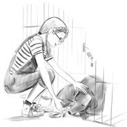
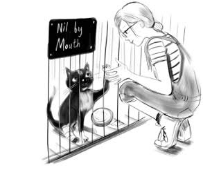 This is where my imagination takes hold. I used my research to dress Isla and also referred to the brief to include key details. Isla is described as having not quite wavy and not quite straight hair and freckles, so I worked these details in. For Isla, it was really important that I included Poppy in the initial illustrations, showing Isla interacting with Poppy would really help to show her loving, caring side.
I submitted a page of different sketches to the publisher to review, the sketches showed Isla with different looks and expressions. We then combined various sketches to create a version of Isla we all felt was right. I then started to add colour to the sketches, again referring to the brief for details like Isla’s hair colour. I then submitted these artworks to the publisher for final approval.
Once we had the artwork for the cover approved, I began work on the inside illustrations. As I created the illustrations that go alongside the text I became more familiar with Isla and her expressions and it soon became second nature as to how she should look in various situations. I was really pleased with how Isla looked and I hope that the readers are too.
***
Thank you so much Lucy. I love how Isla looks, and the artwork really brings the story to life.
Poppy’s Place is out now. You can buy a copy here.