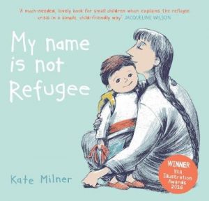
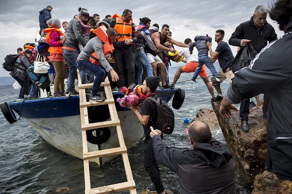
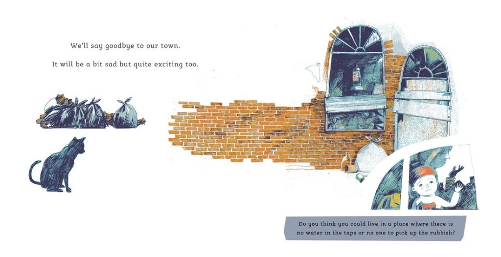
 The rapid changes in the political make-up in our world is rippling through nations and is impacting of all us. These are very difficult times and it is difficult, as well as not wise, to shed children from this reality which will undoubtedly affect them. Children’s books offer a channel to touch on these subjects in the way which is safe and pitched appropriately. There are no subjects that cannot be touched upon within the safe pages of a picturebook, as long as it is done right. The refugee crisis of the last few years has inspired many children’s books across the age range as a result, and amongst these is the stunning My Name is Not Refugee (Bucket List) by Kate Milner. Narrated by a small boy about to undertake the treacherous journey with his mother, the story is told simply, in a tone that even the youngest of children will understand. The narrator asks direct questions, including the reader into its narrative and allowing both child and adult co-reader to reflect on the impact such a situation would have on their own life. This simple direct narrative is particularly effective, because the narrator is relatable; he still loves to play, likes lorries, is weary of new food; a normal little boy in aberrant circumstances. The clean artwork allows this to shine through; the use of negative space prevents us from placing the narrative geographically, highlighting once again that this can happen to anyone. The story ends on play, and the little boy being allowed to be a little boy again, allowing hope to shine through, but without shying away from the difficulties that need to be overcome. My Name is Not Refugee is a powerful book, and I was keen to find out more about how its creation, and was delighted that Kate Milner agreed to answer a few questions to give some insight in the creation of the book.
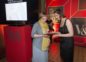
Kate Milner (@ABagForKatie) studied illustration at Central St Martin’s, and has just completed an MA in Children’s Book Illustration at Anglia Ruskin University. Her work has been published in magazines concerned with Housing, Law and Business; and her illustrations and prints have been shown in London galleries and national touring exhibitions. She is the recipient of the 2016 V&A Student Illustrator of the Year Award.
Hi Kate, many thanks for agreeing to answer a few questions. Could you first tell us a little bit more about your background, and how you came to become an illustrator?
I have always drawn pictures. Most children stop around the age of ten or eleven, I never did. Over the years I have worked as a designer, I have painted pub signs and taught art and made illustrations for business magazines but it was the fantastic MA course in Children’s Book Illustration at Anglia Ruskin that really turned me into an illustrator.
So, how did the idea of creating My Name is Not Refugee come about?
The idea for the book came to me in a rush around the very end of 2015 when the news was full of the refugee crisis. The attitude of the tabloid press to people in trouble disgusted me and I wanted to do what ever I could to counter it.
(You can read about more about this in the Independent article following Kate’s win of the V&A awards)
This links nicely into my next question, which relates to this article from The Bookseller, in which My Name is Not Refugee is in fact mentioned. Illustrator Nadia Shireen is quoted as saying that the role children’s book authors and illustrators is to be “quietly political”. Is this a view you adhere to, therefore? Do you feel that in the current climate picturebook makers have a social responsibility?
In the current climate it is hard not to be political. If you don’t do something to counter the depiction of refugees as a zombie army trying to suck all the resources from our country then you appear to agree with it. Every parent teacher or librarian who thinks that the refugee crisis is too political or difficult for children is leaving the tabloid version as the only version they hear. Not speaking out is as political as speaking.
This ‘quietly political’ side of the book is heightened by the way that it interacts directly with the reader, asking questions relating to the story and instigating a dialogue between child and co-reader. How did this come about? Was this planned from the onset?
This was very much a collaboration between the publisher and myself. I had an idea for a couple of questions. For example asking “If you had to sleep in a train station where would you change your pants or brush your teeth” seemed a good way of getting children to think about the realities of being a refugee. The publishers developed the idea and we came up with a question for each page. If you’re trying to engage small children in a class room you ask them questions, it seemed natural to extend this to the book.
Bucket List have created a teacher toolkit accompanying the book which you can download here.
Could you tell us a little more about your artwork? What techniques do you use?
In fact it is very simple, every bit of the art work is drawn with a pencil so that each image has three or four drawings, one for each colour like a lithograph or a screen print. It is then scanned in and coloured on the computer.
The colour scheme is particularly unusual; what was your motivation for this choice?
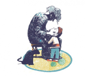
I am interested in the way you use green as the main colour of the mum’s clothing but it is also reflected in the door knob in the waiting room. Is there a specific reason for that choice?
I am very pleased with the way the colour has worked in the book but the credit really goes to Barrington Stoke’s art department. When I originally drew the book it existed only in a very muddy navy blue and a rusty brown which was obviously never going to work in the children’s market.
I am not very good at colour so it took quite a long time for the publishers and I to get this scheme right. Basically they suggested this group of colours and I added the red because I wanted a way to pick out the boy. The mother got green almost by default. To be honest there is no significance to the touch of green on the door knob in the waiting room.*
* My first impression was that this was a metaphor for the mother’s quest for freedom, which could be seen as awaiting her on the other side of the door. This just comes to show that readers’ interpretations sometimes diverge from what the picturebook maker intended, and that each reading experience is unique. There is no right or wrong in our or children’s responses to illustrations.
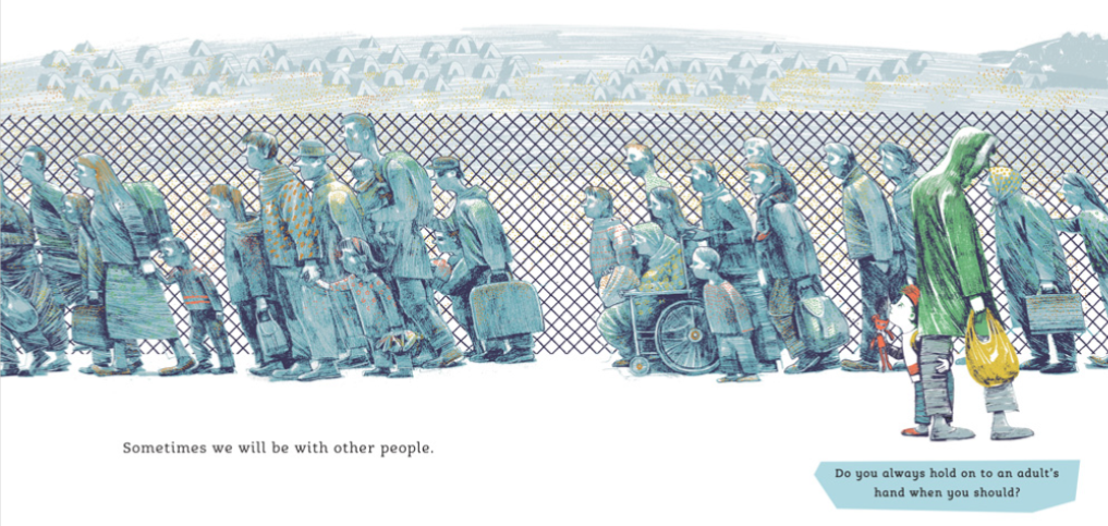
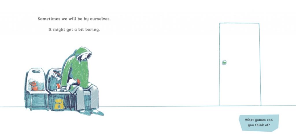
I also find your use of negative space really powerful; plain backgrounds help readers focus their attention on the characters and actions. But was this also a way to ensure that the child’s experience was not linked to a specific landscape and therefore region/people, in order to highlight that this could happen to anyone?
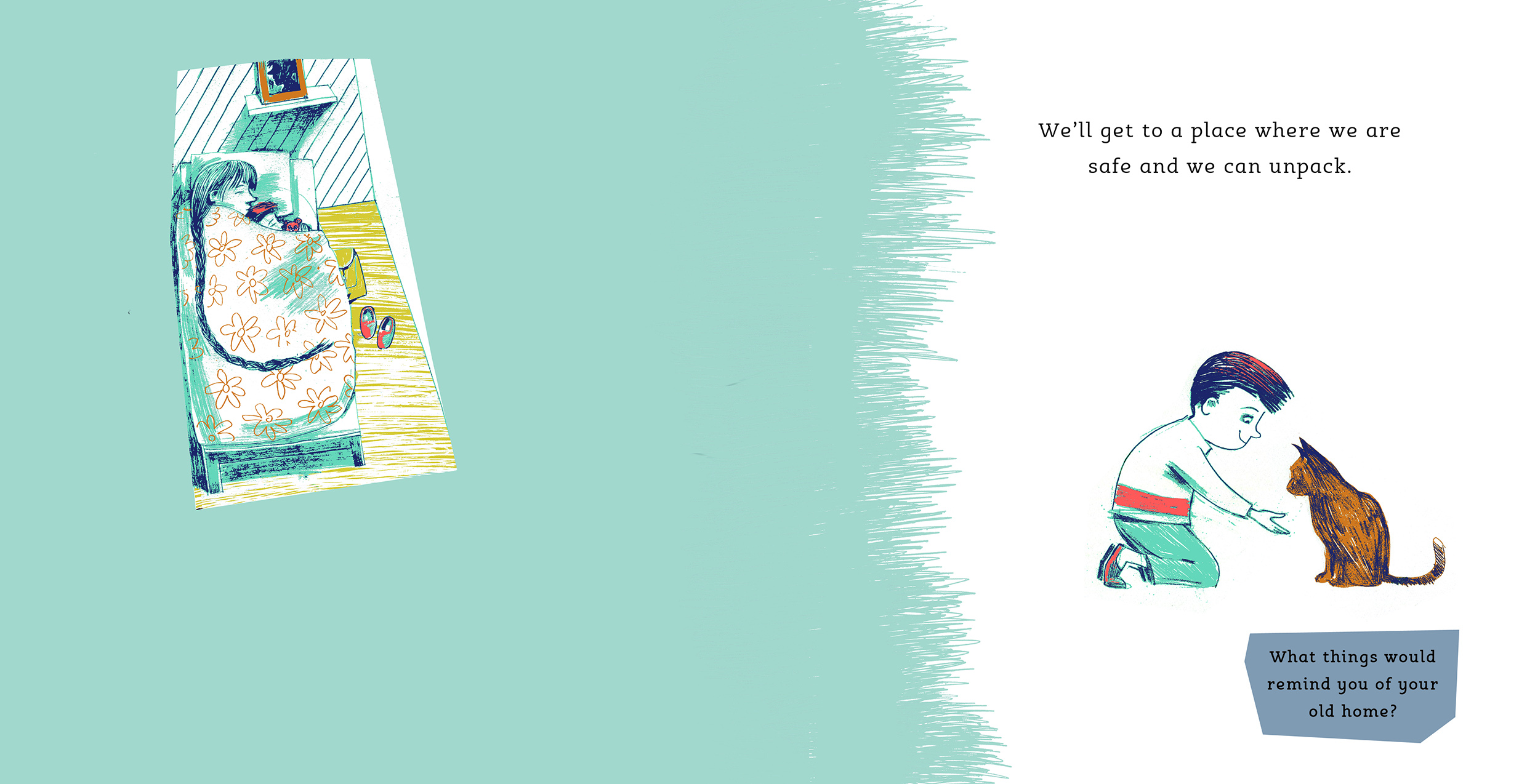
The use of negative space is particularly striking in terms of this particular image (mother and child sleeping in the bed), which is the only image not only using negative space that is not white, but also a frame. Can you tell us more about why you created this image so?
Thank you for your comments about the negative space and lack of specific landscape, you have understood exactly what I was trying to do. I framed the picture of the mother and boy in bed at the end of their journey with colour because I wanted to emphasise the smallness of the room they’re in, (I was thinking of a room in student halls). Some people think that Syrian refugees want to come to Europe in pursuit of material prosperity. In fact the accommodation they get offered is often fairly basic and many of them were relatively well off before the war and have had to leave nice homes behind.
Can you tell us more about forthcoming projects you might have?
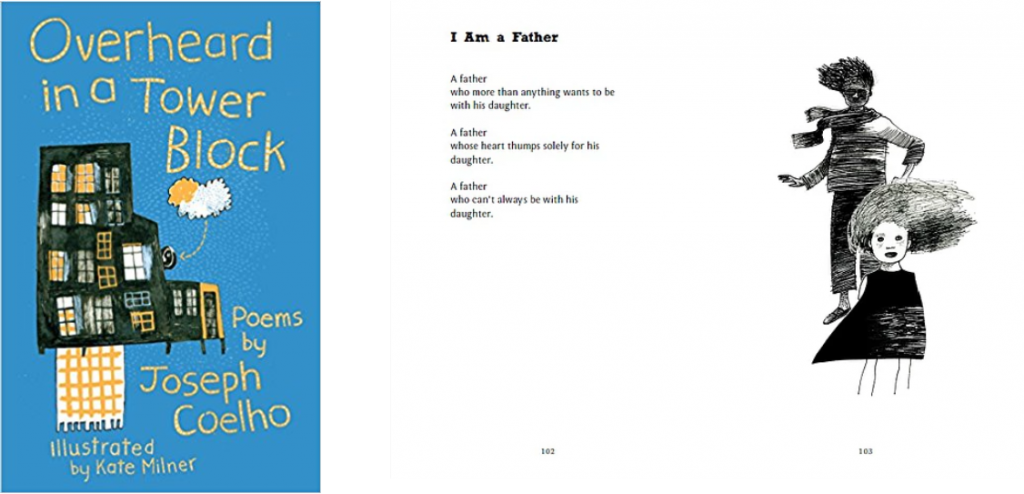
I’m working on some more picture books, some serious, others just plain daft. In July a book of poems by Joseph Coelho called “Overheard in a Tower Block “ will be published by Otter-Barry Books. I’m proud to say I did the illustrations for Joseph’s amazing poems. I think it’s going to be a cracker of a book.
Thank you so much Kate!
***
My Name is Not Refugee is out now and can purchased here.
All artwork © Kate Milner.
Source: review copy from publisher