PatrickGeorge
(PatrickGeorge)
I had really enjoyed Opposites (see my review here) which introduced me to PatrickGeorge’s beautifully designed books and their utterly original use of acetate paper to create visual tricks and effects. The following titles have just been released and are based on the same principle, making full use of the double page and using acetate paper to transform the illustrations.
Colours
Through the use of specifically coloured shapes on acetate paper, Colours not only introduce colours to young readers but also the notion of colour mixing. For example the use of a green shape on the acetate in the double spread below not only allows to create a bear and a frog but also to alter the colours on the page – orange becomes brown, yellow becomes green:
There is a lot not only to see but to discuss with young readers, as one discovers how colours interact with one another. It is fascinating and will appeal well beyond the targeted age as a straight-forward introduction to colour mixing.
Shapes
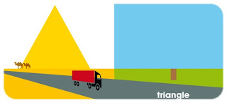
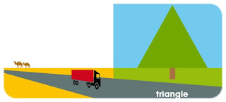
Rather than be a series of unconnected double-spreads, Shapes offers a narrative, as we follow a gift (a red square) from the airport all the way to its recipient and the discovery of what is hiding inside. The use of shapes on acetate here facilitates, and is part of, the storytelling. For example in the double spread below, we can see the truck transporting the gift driving past a pyramid, created by a triangle on the acetate, which then turns into a tree as the landscape changes on the next page:
This works beautifully and the story really needs no words. If anything, it encourages further interaction with the artwork by allowing young audiences and adult readers to make up their own stories. Shapes will also be a real treat for little readers who are keen on transport vehicles as there is a whole selection in this book.
Shapes and Colours might be suitable for 3+, but as with Opposites, their appeal goes way beyond that. Both my children are mesmerised by the visual tricks that the acetate paper facilitates. The combination of contemporary graphic design with child-friendly themes make these books particularly successful. They are beautiful enough that older children and adults will be find them attractive but the use of teddy bears, ice-cream and others will allow them to appeal to the targeted audience. Both books very much encourage interaction between adult and child and although many children will enjoy reading the books and experimenting with the acetate on their own, I think they also offer a great sharing experience.
I don’t think there is anything else quite like PatrickGeorge’s books. This is one independent publisher which will go a long way.
All illustrations © PatrickGeorge
Many thanks to PatrickGeorge for providing review copies of “Shapes” and “Colours”.



[…] Library Mice Through the use of specifically coloured shapes on acetate paper, Colours not only introduce colours to young readers but also the notion of colour mixing. For example the use of a blue shape on the acetate in the double spread below not only allows to create a bear and a frog but also to alter the colours on the page – orange becomes brown, yellow becomes green: […]
[…] Library Mice Rather than be a series of unconnected double-spreads, Shapes offers a narrative, as we follow a gift (a red square) from the airport all the way to its recipient and the discovery of what is hiding inside. The use of shapes on acetate here facilitates, and is part of, the storytelling. For example in the double spread below, we can see the truck transporting the gift driving past a pyramid, created by a triangle on the acetate, which then turns into a tree as the landscape changes on the next page: […]