Bethan Woollvin
(Two Hoots)
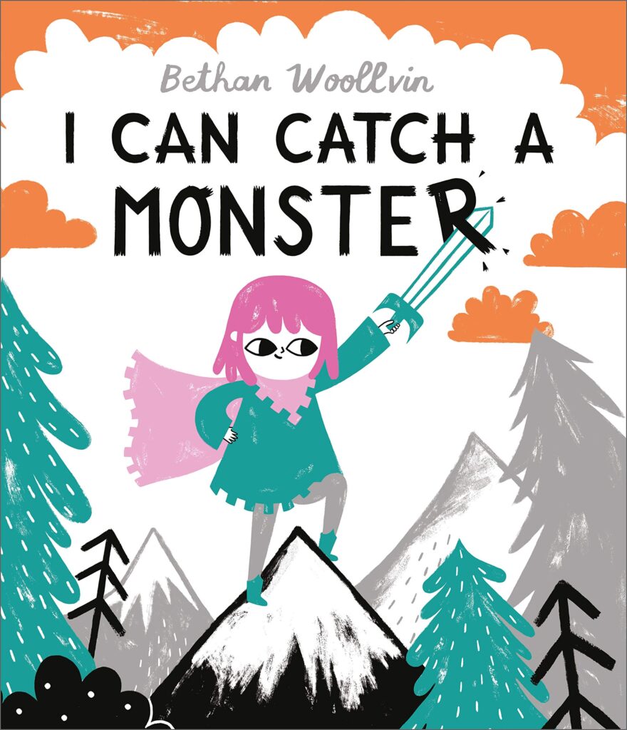
Erik and Ivar are off on a quest to catch a monster and their little sister Bo wants to join them but the brothers are having none of that – Bo is, apparently, too little! Once the boys are on their way, Bo decides to go on an adventure of our own, and she soon proves that being brave when facing monsters can mean a completely different thing.
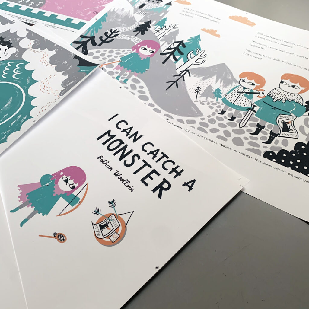
With a tale of castles, knights and monsters and dragons, Bethan Woollvin draws once more on the motifs from traditional tales we have been accustomed to in her work but this is an original story penned by Woollvin herself. Here again she plays with the motifs and fractures them , with Bo the Brave “conquering” the monsters with kindness and empathy. Full of adventure and peril, this story really merges traditional themes with an updated outlook on gender rolls really well. The story also highlights the importance of knowing and respecting the natural world. Woollvin’s signature bold lines are present of course, but in stark contrast to her previous traditional tale titles, where colours are very limited, I Can catch a Monster exhibits a bigger colour palette. I was keen to find out a little bit more about the choices behind that and was delighted when Bethan agreed to write about colour choices for my stop of the I Can Catch a Monster blog tour:
*****
Working with Colour vs Black and White
by Bethan Woollvin

Spending five years playing with traditional tales and creating my own twisted retellings, I decided I was up for a new adventure! Wanting to keep one foot in the fairytale world, I began channeling my love for folklore and traditional tales to write my own new, contemporary tale; I Can Catch A Monster.
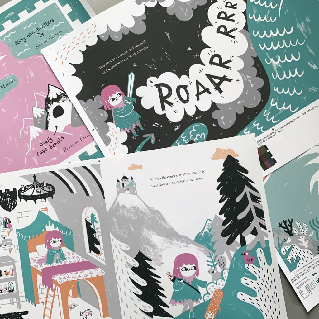
Anchored in a medieval-era, I Can Catch a Monster follows a little girl who desperately wants to go monster-hunting with her brothers, but is told she is far too small! Exploring the kingdom anyway, she goes on a quest of her own to catch herself a monster, meeting some unlikely friends along the way!
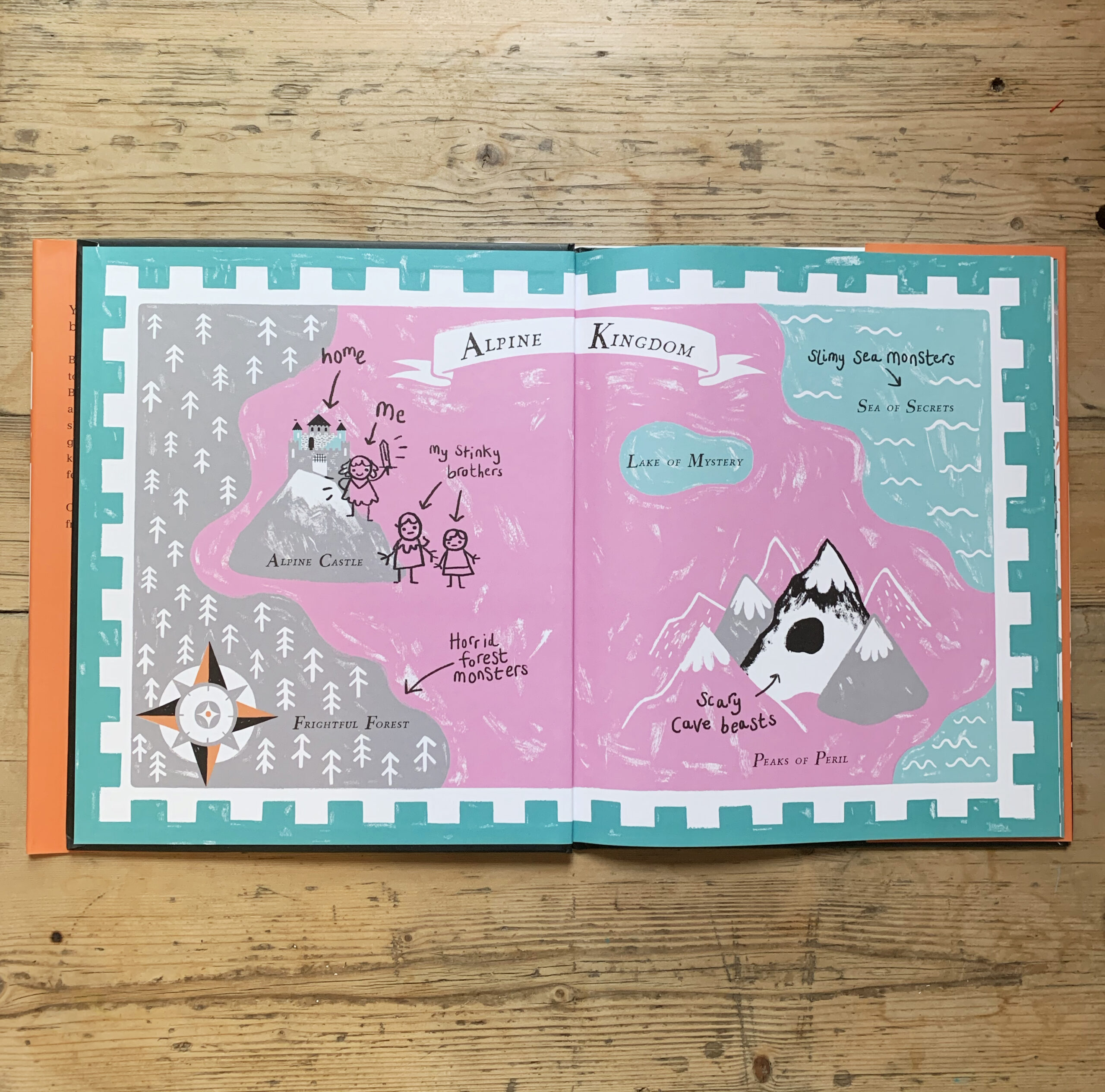
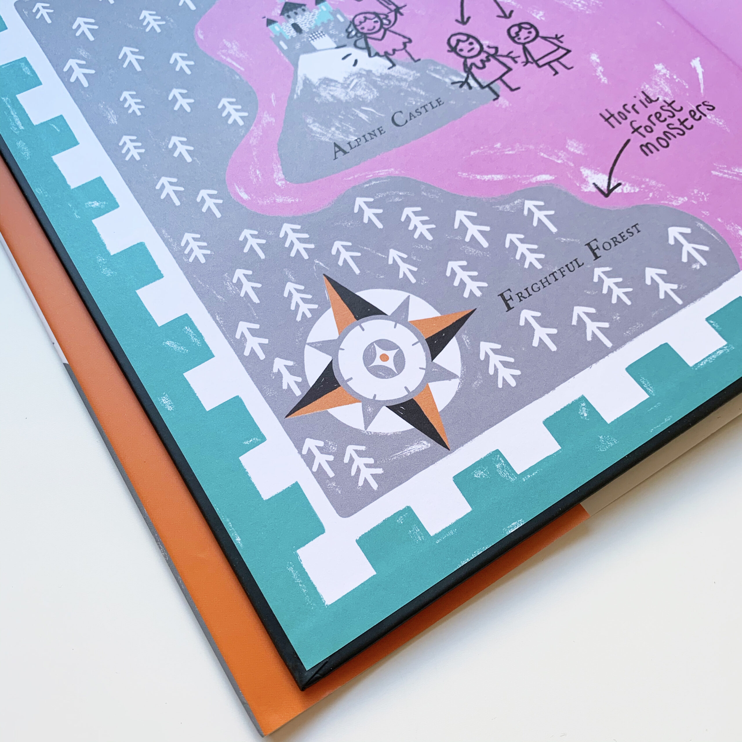
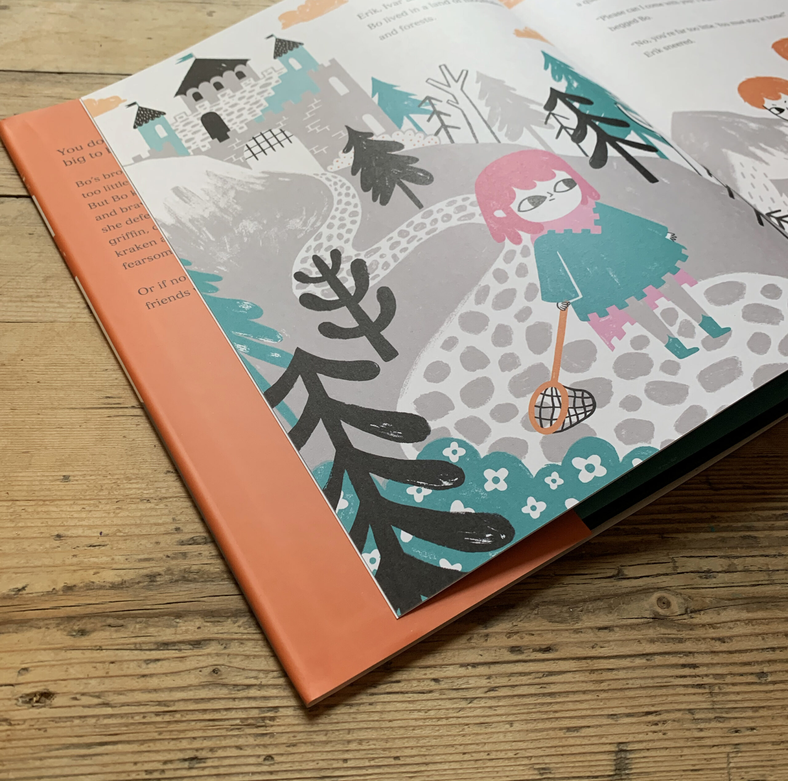
But writing an original story wasn’t the only change to come with this book, I welcomed a larger colour palette to my artwork! My fairytale series featured a robust colour scheme of black, grey and a spot colour which changed with each tale. However, I Can Catch a Monster is printed in five colours in total, orange, magenta and teal, paired with black and grey. But before I talk about the challenges of using a larger colour palette for I Can Catch a Monster, I thought I might explain why I illustrate in this way at all.
People often ask me why I illustrate in a limited colour palette, and there’s actually quite a few reasons for this. It all began while studying illustration at university where I became very inspired by vintage illustrations and printmaking processes. I admired that despite the limitations of early printing methods (such as, coloured inks being incredibly expensive), artists were still able to use just a few colours to their advantage in their artwork.
“Old Fezziwig’s Christmas Ball” by perpetualplum is licensed under CC BY 2.0 
“good housekeeping’s book of ice cream & cool drinks” by limegreen367 is licensed under CC BY-NC 2.0 
“used cars” by limegreen367 is licensed under CC BY-NC 2.0 
https://www.flickr.com/photos/perpetualplum/4176923506/in/album-72157604172708844/ 
https://www.flickr.com/photos/limegreen367/6071438521/in/album-72157616398184601/
With enough thought and clever design, artists were able to make some real masterpieces without a rainbow of colours. More colour doesn’t necessarily mean a piece of artwork is going to look more bold or vibrant. In fact, it can sometimes have the opposite effect all together. This idea is something I use to my advantage in my own work, using a bright colour to draw attention to something of importance, while being surrounded by other objects illustrated in more muted colours such as black or grey.
As my interest in printmaking developed, I began experimenting with screen printing and block printing at university, using just one or two colours to create my artwork. Even when I wasn’t printmaking, it became a natural habit to illustrate in a limited colour palette. Illustrating in this way had some unexpected benefits too, especially when it came to creative block. As a visual thinker, I can come up with an idea for an illustration in my mind pretty quickly. What takes much longer, is translating the image from your brain onto the paper. This is usually where my creative block sets in! However, I find that when I simplify the image in my mind to just a few colours, that translation onto paper happens a lot quicker.
Naturally, this meant that progressing to five colours in I Can Catch a Monster came with some extra challenges for me creatively! I was essentially bringing in two extra possibilities to the equation, and there was a lot of balancing required to make each spread work! Initially, I had thought of illustrating I Can Catch a Monster in three colours, grey, black and teal – keeping my palette consistent with my fairytale books. But it wasn’t until I’d sat down with my publishers that I started to explore the possibility of using more colours in my palette! We talked about the idea of illustrating the ‘medieval world’ in unusual colours, and we flicked through a bunch of colour swatches to find the most unlikely colours for this setting. We tend to associate the medieval era with dark, murky colours, such as greys, browns, deep blues and greens. But I wanted to show my medieval world in a different light! Along with black and grey, we chose three garish colours–a zingy orange, a rich teal and an eye popping magenta. There’s definitely nothing medieval about these colours!
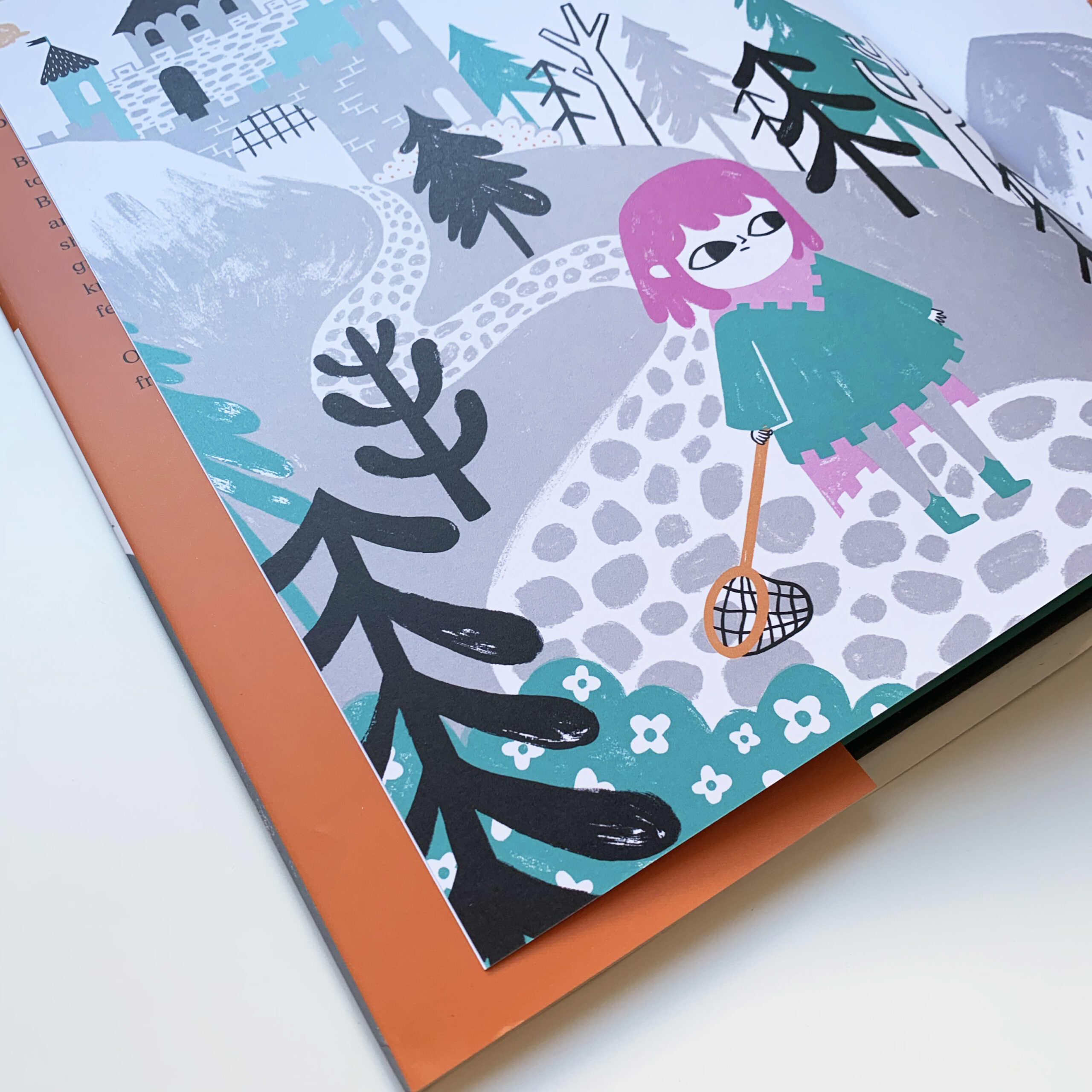
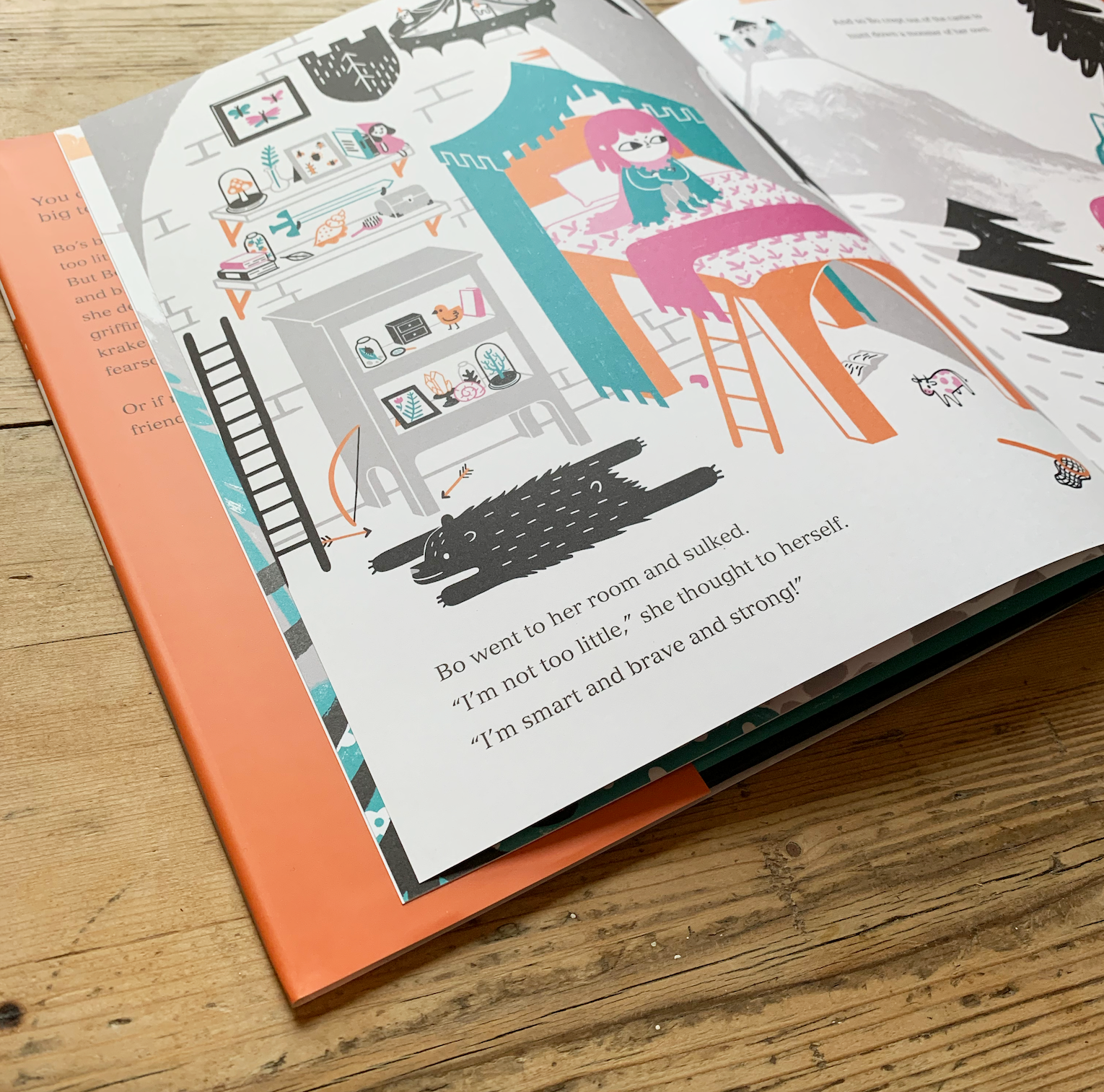
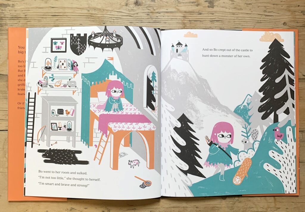
At times when I was illustrating this book, it felt like the colours were way off. On some spreads, I had unconsciously illustrated in just three colours, and I had to find a way to weave the rest of the palette back into the artwork! I can spend hours and days working on the colour combinations of every character, object and tree, just to get the balance right! Despite all of these challenges, I couldn’t be happier with how the artwork turned out. My favourite spread created for the book was the interior of Bo’s bedroom. It was great fun illustrating all of the little trinkets and collected objects, letting her personality shine through visually.
Now, I can’t say for sure whether my next book will be illustrated in two colours or ten, but either way, I hope you all enjoy I Can Catch a Monster and it’s vibrant medieval colour palette!
Thank you so much Bethan for this great guest post!
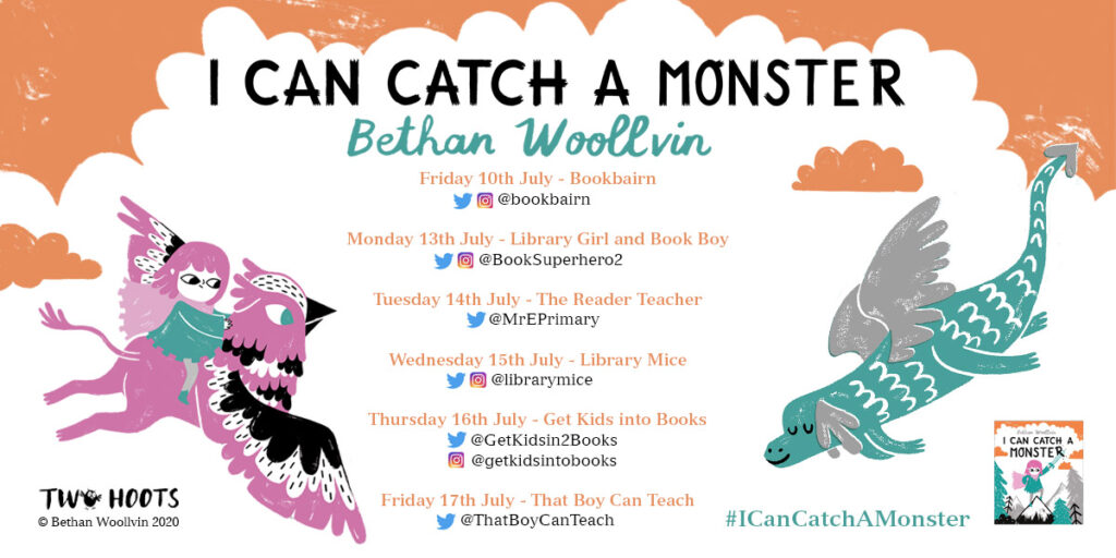
I Can Catch a Monster is published by Twoo Hoots and is out now. It can be purchased here.
Follow the rest of the blog tour:
Source: review copy kindly provided by publisher