Don’t judge a book by its cover. Are we not always telling children this? Yet the intended audience of picturebooks are, for the majority, pre-literate and as a result particular care is given to designing covers and other peritextual elements for picturebooks (defined more or less as anything other than the narrative, such as dust jackets, endpapers, title and dedication pages etc. ). In fact, peritextual elements are vital tools for ‘readers’, allowing them to determine genre, predict plot, sense mood and identify settings and characters (Sipe). The information given by the cover is therefore vital, wetting the appetite of readers, feeding their expectations of the story. Here is a closer look about different types of cover designs readers might come across.
Front and back covers
-Wrapround covers
One picture extend from the front across the spine to the back, such as the cover of Levi Penfold’s The Django (Templar):
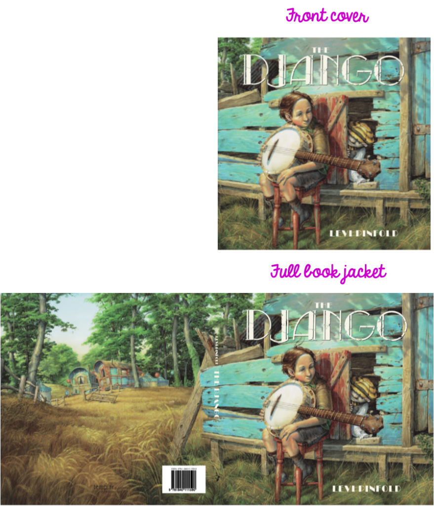
From the front cover, readers can make many assumptions about the setting of the story. My personal response would probably be a farmyard, with the assumption this is a chicken coupe. Opening up the full jacket not only gives a sense of space, but also a sense of scale. Readers can also make further assumptions: the character on the cover might be from a travelling community, and, looking at the caravans, it is likely that the story takes place a long time ago. Readers might also wonder why the main character is sitting away from the rest of the group.
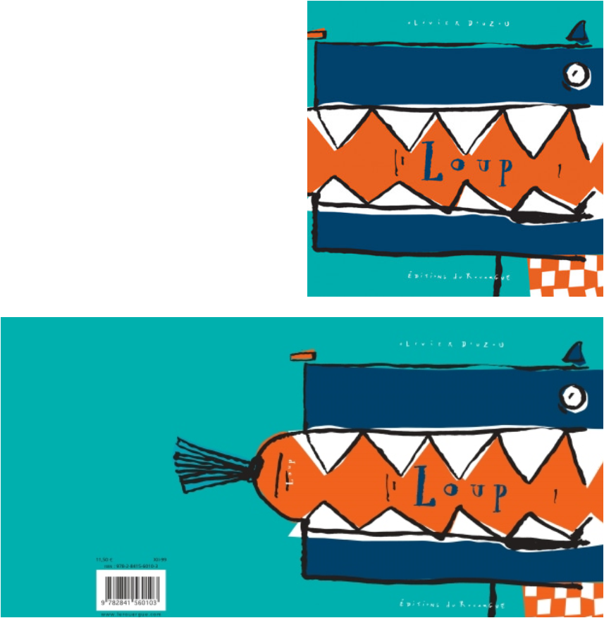
Sometimes the wraparound cover is used to create an element of surprise. Olivier Douzou’s Loup (Editions Rouergue ) uses this by playing with readers’ expectations of wolves’ behaviour:
– Dual image covers
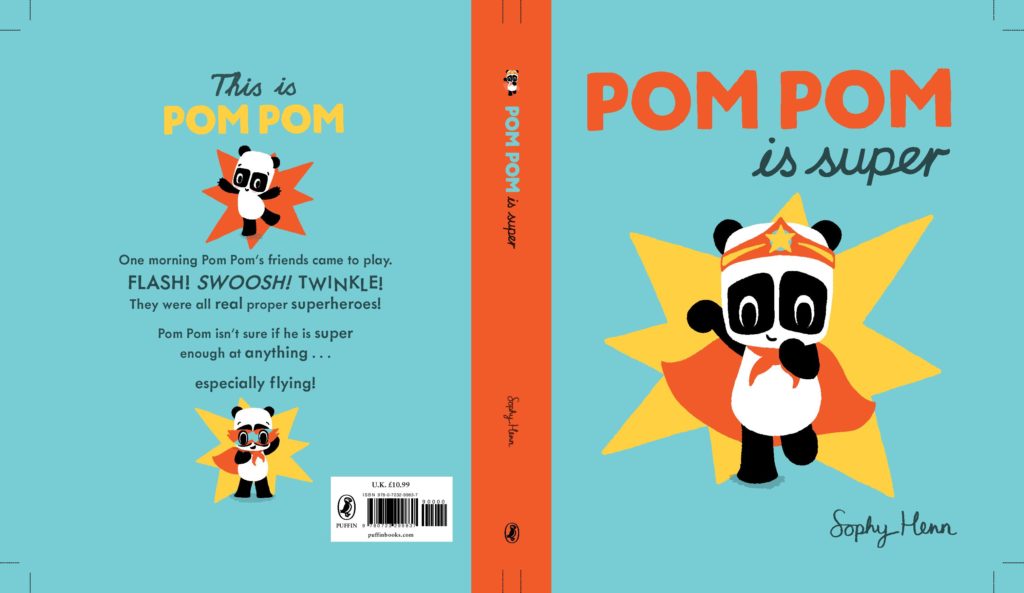
Some covers are made out of two different images, recto and verso. The back cover might recreate a scene from the book, or introduce the characters from the story, as is the case with Pom Pom is Super by Sophy Henn (Puffin). The illustrations on the back cover introduces Pom Pom pre and post ‘super’ transformation.
In Claude Ponti’s My Valley (Elsewhere Editions) , the back cover introduces the characters but with little else information. However, readers do get an impression of playfulness straight away. In the original French edition, it is the barcode rather than publisher logo that is falling down, Ponti being renown for always integrating ISBN barcodes as part of his back cover artwork.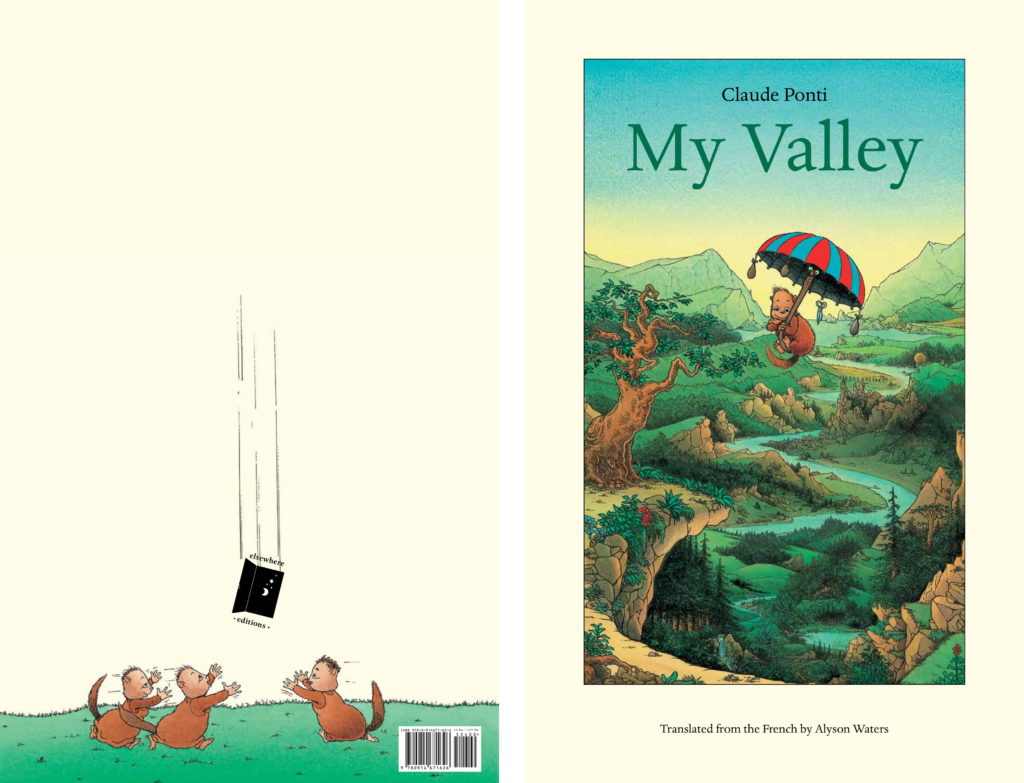
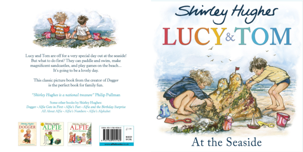
On the back cover of Lucy & Tom at the Seaside, the back cover repeats the illustration from the title page, and along with the front cover complement the main theme of the book.
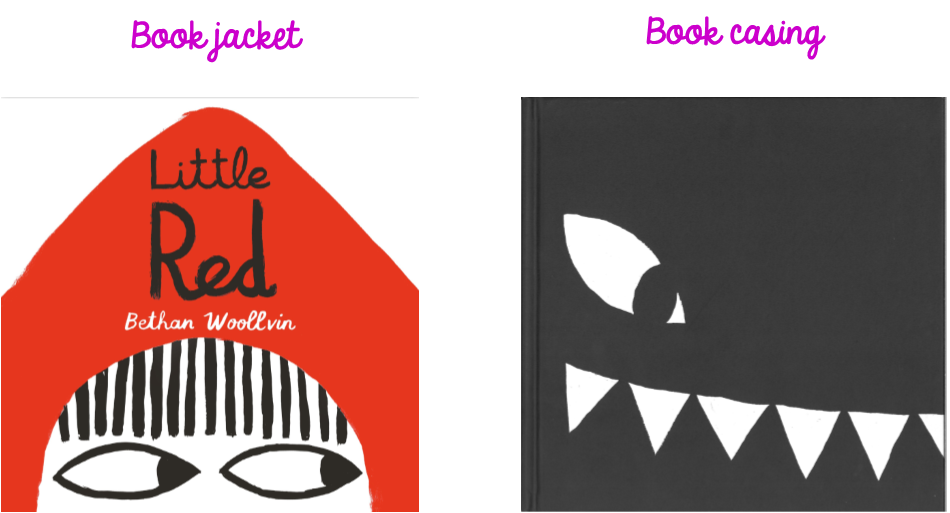
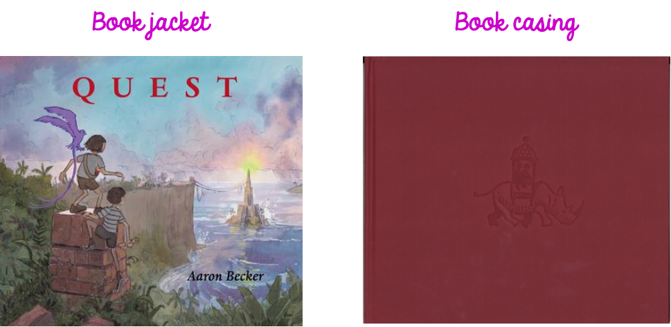
– Book jacket & Book casing
Hardback picturebooks sometimes include a dust jacket, and as a result might end up having two very different covers – one for the dust jacket (which will often, but not always, become the paperback cover) and one for the case.
In the case of Little Red by Bethan Woollvin (Two Hoots), the dual covers allows readers to be introduced to the two main protagonists.
Sometimes the book casing will not be fully illustrated but instead include a small illustration, a repeating pattern or even a debossed pattern over block coloured casing.
The image chosen for the cover
– An illustration taken from the book
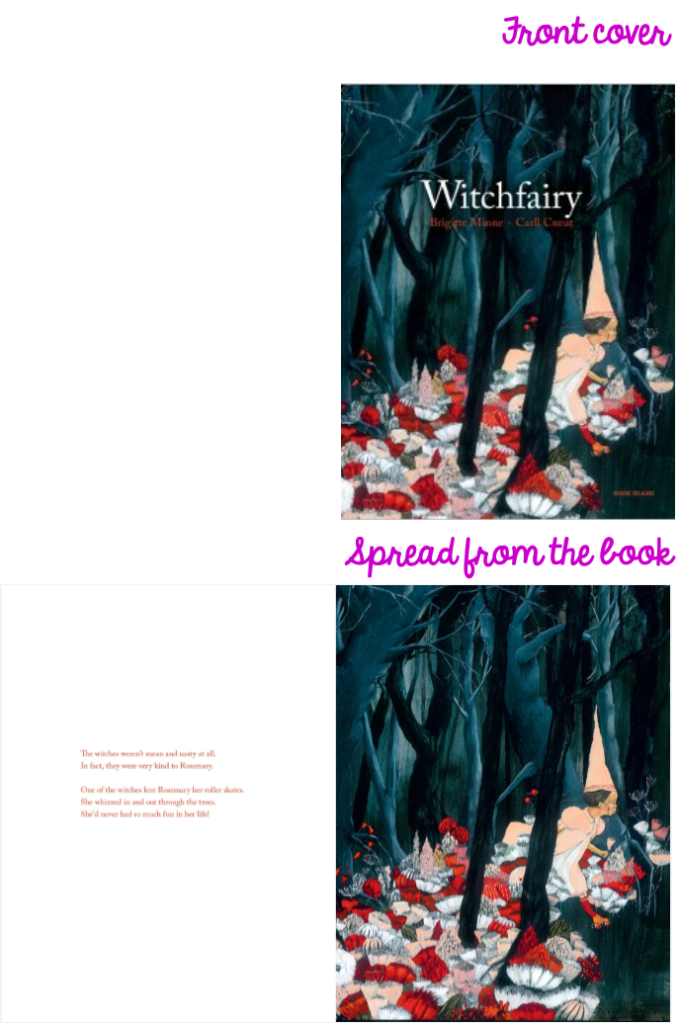
Covers that are duplicates from an inside spread “seem to have been chosen to convey the essence of the story inside and thus set up appropriate expectations for it” (Nodelman). Here is an example from Witchfairy by Brigitte Minne & Carll Cneut (Book Island), which takes it cover from a spread from the book.
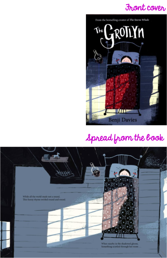
Interestingly it is actually not that common for book covers to be a complete duplicate of an illustration from the book. Often if a spread from the book is used as cover illustration, it will be a slightly different version, whether it is colour, or position or simply some objects added or removed, as in the example below from the hardback edition of The Grothlyn by Benji Davies (HarperCollins Children’s Books):
– An illustration not found in the book
According to Nodelman, illustrators “often try to create appropriate expectations by pictures on covers or dust jackets that appear nowhere else in a book and that sum up the essential nature of the story” (49).The cover of Oliver Jeffers’ Stuck (HarperCollins Children’s Books) illustrates Nodelman’s statement perfectly:
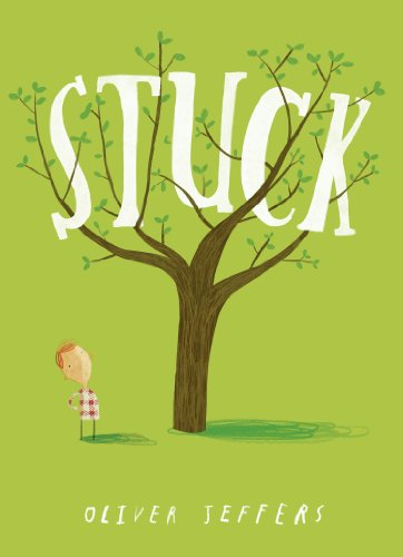
The main elements of the narrative are present: Flyn, looking confused, a tree, and something stuck in it. Even pre-literate children, who would not be able to decode the word ‘stuck’, will nonetheless get the meaning as the title has cleverly been set as part of the artwork (also called intraiconic text).
– Ambiguous book covers
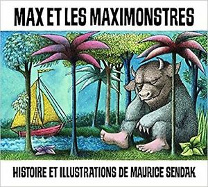
Some illustrators (or indeed book designers) create book covers which do not fit into Nodelman’s definition. For instance, the cover of Where the Wild Things Are by Maurice Sendak (Red Fox) famously lacks its main protagonist, creating a possible confusion for the reader. Discussing the cover of the book, Leonard S. Marcus suggested that “the cover image was meant to be another open door, and a signal to readers that they were going to have to venture inside”. He adds the he doubts this cover design “would make it past any present-day publishing committee.” This omission is particularly striking in the French translation, as Max is named in the title, Max et les maximonstres (L’École des loisirs). Readers are then left to wonder whether Max is the monster in the picture, who is about to meet other, bigger (‘maxi‘) monsters.
The cover of Eve Coy’s Looking after William (Andersen Press) is also ambiguous. The reader might assume from looking at it that the child on the cover is a boy called William and that the story focuses on looking after him when in fact, the story is told from the little girl’s point of view (the astronaut helmet adding to the ambiguity) with her telling the story of ‘looking after’ her dad, named William.
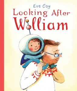
Interestingly, the American edition is called Daddy-Sitting, and the forthcoming paperback edition will be called Looking after Daddy, thus removing the ambiguity.
Another completely ambiguous cover is from wordless picturebook The Tree House, by Ronald and Marije Tolman (Lemmiscaat):
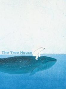
The ocean, a whale and a polar bear: an intriguing combination but one that would not necessarily be associated with tree houses. Here, the ambiguity tickles the reader’s curiosity- how on earth will they encounter a tree house?
Do those covers create false expectations? Maybe, but this is in turn creates an element of surprise as readers identify their expectations might have been purposely misdirected.
Does the cover impact readers’ expectations?
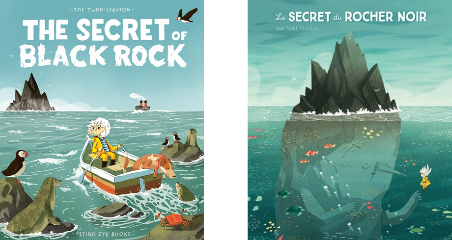
We make assumptions, as seen above, and therefore by doing so, we make a judgement. Which is why I was very interested to see that the French editors of The Secret of Black Rock, L’École des loisirs, decided to change the cover of the book completely, presenting the reader with a completely different entry point into the narrative, including giving away the secret of Black Rock right from the start:
I was intrigued as to why they would do that, taking away the charming element of surprise in this narrative. So I asked them why, and this was the reply from the design team:
“We did not feel that the cover of the original edition reflected the intensity of the interior artwork: it gives the impression that the heroine is simply going sailing and lacks dramatic tension. We felt it would be more interesting to show the point at which both characters meet, a key moment in a narrative, even if it meant giving away part of the plot.”
It is an interesting point; is it more important for covers to be enticing, even if it means giving some of the narrative away, rather than keep any excitement inside?
Does shape and size tell us anything?
Though format is a different aspect of picturebook anatomy, the two are interlinked, both influenced by content and theme. For example:
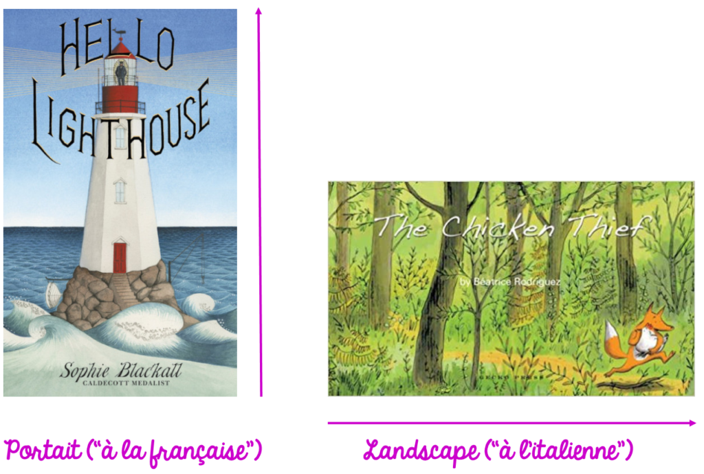
The cover of Hello Lighthouse by Sophie Blackall (Hodder Children Books) uses a landscape orientation, which emulates and emphasises the shape of the building. Meanwhile, Béatrice Rodriguez chooses the portrait orientation for her book The Chicken Thief (Gecko Press), highlighting the idea of movement, particularly with Fox in the bottom right corner of the illustration, just about to run ‘off’ the book.
Debi Gliori’s Greenaway Medal shortlisted Night Shift offers another interesting example; not only was the illustration changed from hardback to paperback, but the size of the book also.
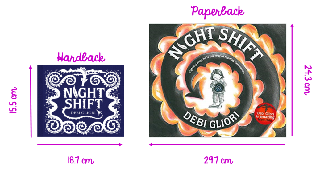
What does it mean it terms of reading experience? A smaller book offers a more intimate reading experience. A larger format facilitates a shared reading experience, but also might make the book less daunting for some readers. This is accentuated by the addition of the main character on the cover of the paperback as well as more colour. The new cover gives more of an inkling as to what the book is about (heightened by the addition of the tag line “Fighting dragons is one way of fighting depression”). These two covers of the same story ‘speak’ to different readerships.
Sources:
Leonard S. Marcus Face Out: Picture Books Covers (Horn Book, November 2012)
William Moebius Introduction to Picturebook Codes (Word & Image, Vol. 2, No. 2, 1986)
Perry Nodelman, Words about Pictures (University of Georgia Press, 1990)
Lawrence R Sipe Storytime: Young Children’s Literary Understanding in the Classroom (Teachers College, 2008)